Working on my first font specimen. It’s fun.


| Shop | http://3sa.co |
| Web | https://blog.threestepsahead.com |
| Pronouns | he/him |

A Futura follower designed at Intertype for Condé Nast’s Vogue magazine, announced in 1929 [The Iowa Publisher, 1929] and released in early 1930, in Light and Bold [ad in Editor & Publisher, Feb 1930] [E&P, Mar 1930]. Extended with Extra Bold w/ Oblique [PEE, May 1931] [PEE, Aug 1931], Light Oblique [Inland Printer, 1932], Bold Oblique [PEE, 1933], Condensed [PEE, 1936], Extra Bold Condensed [B&BP, 1937] and Bold Condensed [B&BP, 1938], Extra Bold Condensed Oblique [B&BP, 1939], Medium Condensed [PEE, 1946]. A specimen booklet from 1956 [Inland Printer] shows all eleven styles. Intertype offered several sets of alternates to emulate other sans serifs like Kabel [PEE, 1931], Futura (incl. its early angular forms), and Tempo [1956 specimen]. Intervogue is a loose revival and expansion made in 2018 by Richard Miller. VF Sans shares some attributes. Nil (2015) is a loose interpretation made by Alex Chavot for the exclusive use by deValence. See also Store Norske Tango (2021).
Here it is! https://shifthappens.site/gorton-perfected-specimen.pdf
Any feedback is very welcome. Even though it’s out, I’m still working on it! I have so many photos of Gorton in use it’s hard to choose sometimes.
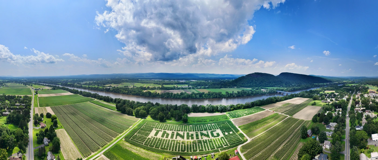
Today @FontsInUse features a truly mind-blowing use of my typefaces Fit and Lab DJR for http://mikesmaze.com, rendered in corn at font sizes upwards of 100,000pt.
The maze asks the question “In the age of artificial intelligence, what makes us human?” and was designed by Jess Marsh of Hired Hands Signs (https://www.hiredhandsigns.com / http://instagram.com/hiredhandsigns). She even used Fit’s variable width axis to help the text align with the rows of corn and the size of the field!
https://fontsinuse.com/uses/55689/mike-s-maze-2023-what-makes-us-human
Over the past days, we have published more than 25 new uses of #fonts with interlocking letterforms. https://fontsinuse.com/tags/10566/interlocking-letterforms
The examples include film titles and posters, record and book covers, food packaging and more. They range from 1961 to 2023, and from Brazil to Greece and the Philippines.
See all uses of the featured fonts by Headliners, Filmotype, PLINC, Lettergraphics, House Industries, @typodermic, and PintassilgoPrints: https://fontsinuse.com/search/advanced?v=2&match0=all&typefaces0=230949,40498,125579,144046,28096,29098,28977,202766,115266,161117,126972,91899,125578

Sixty years ago, in November 1963, #MauriceSendak published his now famous #ChildrensBook, Where the Wild Things Are.
Did you know that the casual letterforms on the first edition #BookCover aren’t custom drawn, but type? They stem from an obscure #font named Safari which came with numerous alternate glyphs. Patrick Concannon put together a post about the #design, and @jaykay109 tracked down the origin of the #typeface. More: https://fontsinuse.com/uses/54045/where-the-wild-things-are-by-maurice-sendak-h

From Wikipedia: Where the Wild Things Are is a 1963 children's picture book written and illustrated by American writer and illustrator Maurice Sendak, originally published in hardcover by Harper & Row. The book has been adapted into other media several times, including an a