Jay

@jay@metalverse.social
1 Followers
20 Following
56 Posts
Web and Java dev. Mac and Win user. PS5 and Switch player.
Projectshttps://gillibrand.github.io/projects/
Keyframe Clickhttps://gillibrand.github.io/keyframe-click/
The original Windows 95 Start Menu helped, but kinda sucked. Too disorganized. Usually sorted by company name folders and full of readmes and license files. Ugh. Win 7 era added decent search by app name. They never made a Win 8, right? Win 10 focused on being a good app launcher instead of just an alternate file system view. Win 11 refined that more has good search of settings and other stuff. So, yeah, modern Start Menu is pretty good.

So macOS Tahoe Spotlight/Apps (in Dock) is basically... a Windows 10+ era Start Menu! Good.

I use LaunchBar, but when my kids first started on the Mac (after iPads, Chromebooks) they were lost if an app wasn't pinned in the Dock. Spotlight in the menubar is hard to find and the name meant nothing to them. Clicking on the Finder to navigate to "apps as files" was confusing and slow. Launchpad was supposed to be the answer, but is an abomination. Tahoe seems to unify and improve all these.

@stroughtonsmith Cool isolated demo, but now I must stare dead center in the window and repeat, "focus on the content, focus on the content..."
Quick, search field or menu item?
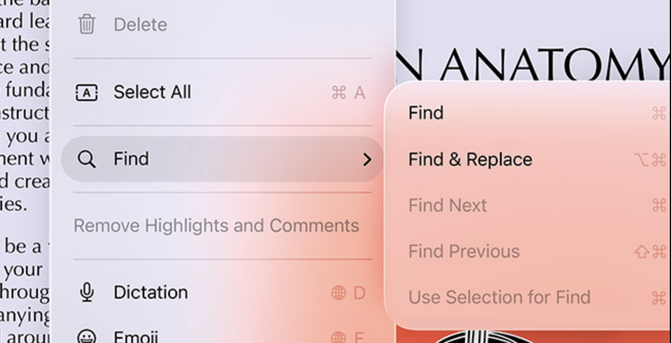
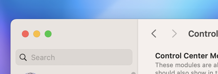
I'm glad search fields in sidebars/Settings no longer look perpetually disabled. Too bad toolbar search looks like an edgeless blur. At least it's not gray!
@tuomas_h I think it's the disparity of what we clearly see vs what they claim to care about. They talk about visual clarity, while showing nearly unreadable glass blobs at times. And are still hammering on "focus on the content," but now controls are flashing like LEDs if any content dares scroll near them.
@marioguzman History be damned... all these are equally clickable!
@BasicAppleGuy please popularize #liquidass to tag all these grotesque macOS Tahoe shots
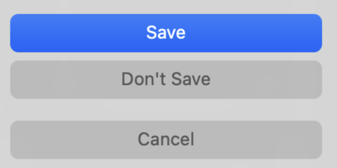
@marcoarment yeah, Settings app, missing title bars, skinny alerts, etc. were all terrible, and they… well…
@ravi No need to wait to judge... we've seen transparent UIs for years, and they always fail for no benefit. Start hating it today!