This morning I resurrected an old thing I deleted and felt guilty about ever since. I still feel bad I broke all the links to it but hey 11 years of blogging and 1 link being deleted is not bad, right? (Please forgive me I beg you.)
~Hypercard~

| Website | https://robinrendle.com |
| Location | San Francisco, CA |
This morning I resurrected an old thing I deleted and felt guilty about ever since. I still feel bad I broke all the links to it but hey 11 years of blogging and 1 link being deleted is not bad, right? (Please forgive me I beg you.)
~Hypercard~
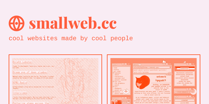
I love this website highlighting the Small Web:
Seriously, that is the Web I want.
🎉 A new thing I made — Citywide, a sans serif typeface inspired by mid-1900s bus roll signs.
It has some real charm, feeling both informal and buttoned up in the same breath. It’s still a work in progress, but already a large family of widths and weights, plus italics.
Read more about Citywide and bus roll signs, and grab a license: https://shop.jasonsantamaria.com/products/citywide


I think every designer should write a love letter to a font at least once in their lifetime.
This is mine: A 150-year-old font you have likely never heard of, and one you probably saw earlier today.
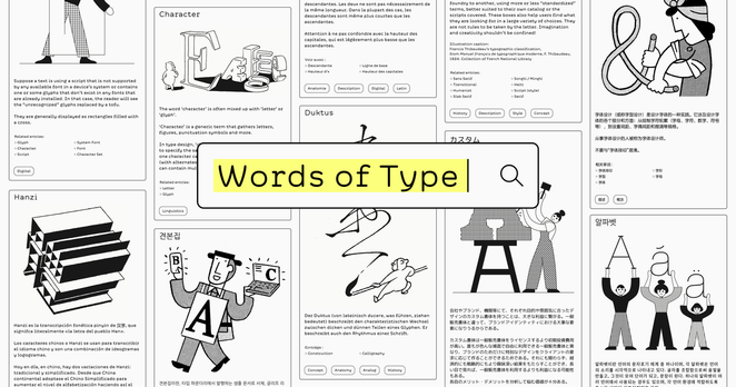
@wordsoftype beta is now launched, as announced by @lisahuang at Face/Interface: https://wiki.wordsoftype.com/
United States Postal Service Corporate Identification Guidelines, 1971.
“The prime elements in [the service mark] are the eagle and the red/white/blue ‘U. S. Mail’. The eagle will be used as a right-facing symbol on all communications except where a directional motion is involved (Examples: the letter carriers’ shoulder patch, or the emblem on the left side of vehicles.)”


new year, new website :) with thy surest steel gathered to thy side, turn to face these new nightmares, these...True Terrors (of the New Dark Web)
plenty to do but i'm thrilled to publish this 🤍 thanks a lot if you end up taking a look, but hark! go heedfully:
scroll with caution & with care!