Robert Kosara

@eagereyes@vis.social
11 Followers
114 Following
141 Posts
Data Visualization Developer at Observable, formerly Tableau Research. Recovering academic. Runner. ISOTYPE collector. Synth dabbler.
websitehttps://eagereyes.org
YouTubehttps://www.youtube.com/@eagereyes

🧠 Join us tomorrow for the final live session of our Data Visualization Fundamentals and Best Practices course led by Data Visualization Developer by @eagereyes

Sign up here: http://ow.ly/Awgg50Nn3jK

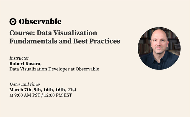
Course: Data Visualization Fundamentals and Best Practices

When do you use a bar chart over a line chart? What are area charts good for? What's wrong with pie charts? Learn about how these different types of data visualization work, and how they're used, in Observable's first data visualization course! Attend lectures (or watch them later), ask questions, and once you've completed a small assignment at the end, you'll earn a certificate. What you'll learn With Observable Plot, you can build data visualizations in half the time it takes in other tools. And, we’re he
Observable

🧠 Tomorrow: Part III of our Data Visualization Fundamentals and Best Practices course led by Data Visualization Developer @eagereyes

⬇️ Sign up below!
http://ow.ly/2puB50NgVJV

Course: Data Visualization Fundamentals and Best Practices

When do you use a bar chart over a line chart? What are area charts good for? What's wrong with pie charts? Learn about how these different types of data visualization work, and how they're used, in Observable's first data visualization course! Attend lectures (or watch them later), ask questions, and once you've completed a small assignment at the end, you'll earn a certificate. What you'll learn With Observable Plot, you can build data visualizations in half the time it takes in other tools. And, we’re he

Observable
@eagereyes of @observablehq is hosting a free 5 part webinar on #dataviz fundamentals. It's very beginner friendly and the first two parts can already be found on youtube https://www.youtube.com/watch?v=WJ1c54Ab-o8
https://www.youtube.com/watch?v=fEWjVkQBNfg
March 7th: Course Part 1: Data Visualization Fundamentals and Best Practices - with Robert Kosara

YouTube

I don't get mad about macOS redesigns, and I don't mind the iOS-ification for the most part. But WTF happened to System Settings? Why is everything hidden behind "i" and "Options…" buttons? This makes no sense.

Check out the Firewall page, all it contains is an on/off toggle, all the settings live in a sub-window. Why?

🧠 Beginning on March 7th, Data Visualization Developer Robert Kosara @eagereyes will lead Observable's Data Visualization Fundamentals and Best Practices course.

Sign up here: http://ow.ly/CF3F50N0Os0

Course: Data Visualization Fundamentals and Best Practices

When do you use a bar chart over a line chart? What are area charts good for? What's wrong with pie charts? Learn about how these different types of data visualization work, and how they're used, in Observable's first data visualization course! Attend lectures (or watch them later), ask questions, and once you've completed a small assignment at the end, you'll earn a certificate. What you'll learn With Observable Plot, you can build data visualizations in half the time it takes in other tools. And, we’re he

Observable
I just downloaded "Red's First Flight" (aka the original Angry Birds without the micro-transactions) onto my phone. AMA.

I'm teaching a course on Data Visualization Fundamentals and Best Practices for @observablehq starting March 7. The course is free, all you need is an Observable account (which is incidentally also free!).

Sign up here: http://bit.ly/3ImKeus

Course: Data Visualization Fundamentals and Best Practices

When do you use a bar chart over a line chart? What are area charts good for? What's wrong with pie charts? Learn about how these different types of data visualization work, and how they're used, in Observable's first data visualization course! Attend lectures (or watch them later), ask questions, and once you've completed a small assignment at the end, you'll earn a certificate. What you'll learn With Observable Plot, you can build data visualizations in half the time it takes in other tools. And, we’re he

Observable
A little time lapse experiment with star trails. There's also a couple of bonus boats, and the blob you see at the beginning is the setting moon.

We ran out of spots in this course, it's more popular than we expected 😅 If you got a message saying that the course was closed, please try again!

https://vis.social/@eagereyes/109910767195009320

Robert Kosara (@eagereyes@vis.social)

Attached: 1 video I'm teaching a course on Data Visualization Fundamentals and Best Practices for @observablehq starting March 7. The course is free, all you need is an Observable account (which is incidentally also free!). Sign up here: http://bit.ly/3ImKeus

vis.social
View numbers on the bird site are annoying when you're not getting much traction, but when a tweet starts taking off, they're pretty fun 🤷‍♂️