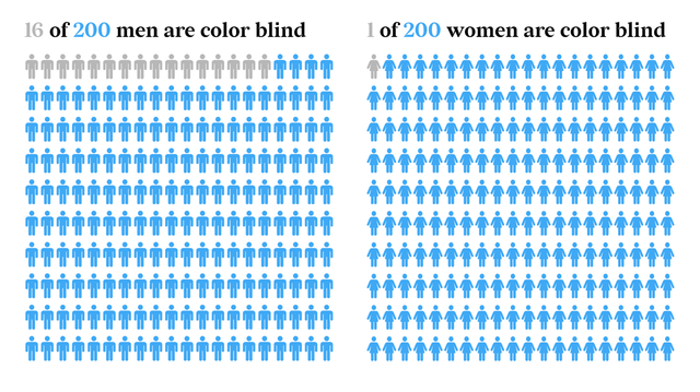
Did you know that around 300 million people in the world are colorblind? 👀
For this reason, you might want to make sure your design is readable to everyone.
The visualization of these stats in the post is an example of an icon array chart designed with Datylon.
Discover how to make your data visualization color blind-friendly. We explain some of the best and less good choices possible in terms of graphs and colors. 🎨
➡️ Read more: datylon.co/lors