Type Specimens

108 Followers
125 Following
20 Posts
The growing type specimens collection of Matthijs Sluiter, previously on Instagram.
Matthijs Sluiterhttps://typo.social/@MatthijsSluiter

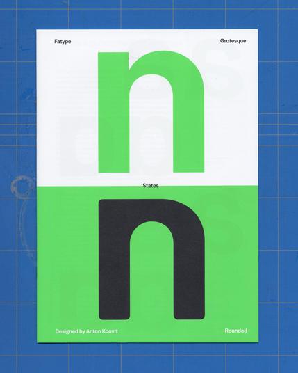
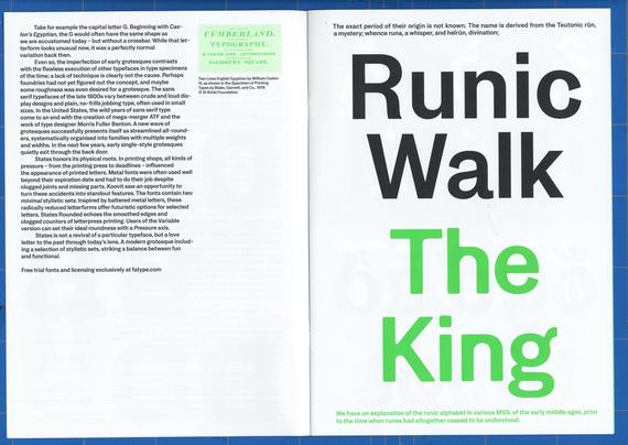
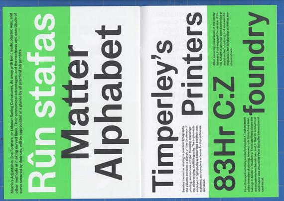
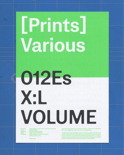
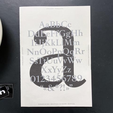
Specimen booklet for States, designed by Anton Koovit and published by Fatype, 2025. The A4-sized specimen booklet comprises 16 pages and was designed by Federico Barbon Studio. In addition to typeface samples, it includes a short piece by yours truly on the rise and fall of early grotesque gothics.

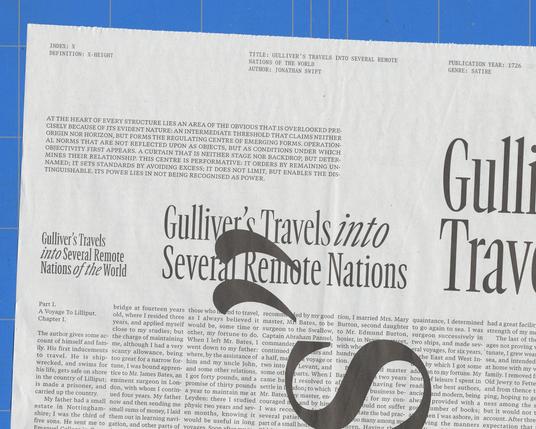
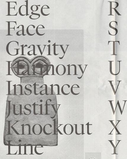
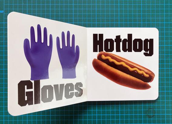
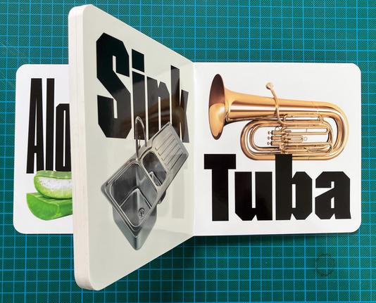
States is shown throughout the specimen in a single Medium weight, in both a standard and a rounded version. Meanwhile, the family has been expanded to seven weights and italic versions for both styles.

https://fatype.com/typefaces/states

#typespecimen #fatype #antonkoovit #yassinbaggar #federicobarbon #matthijssluiter #typehistory #spotcolors

“Romain du Roi was not widely released for general use, reinforcing its role as a symbol of royal exclusivity.” The elusiveness of the original lends extra sparkle to the revival’s accessibility – at least that’s what seems to be going on here. Interesting.

A2 format specimen poster for Romain du Roi, Ian Party’s version of a famous piece of design history, released in June 2025 through his Newglyph foundry. Printed on one side only, in black and silver, folded to A4 format.

#typespecimen #romainduroi #leromain #ianparty

Aeonik Soft was designed by Mark Bloom and released by his foundry CoType in January 2026. Where most specimens on my desk come with a short personal note, or no note at all, this one was sent out to all receivers with a letter explaining the rationale for adding a soft counterpart to their successful Aeonik type collection: “(...) Aeonik Soft softens those edges to create a more approachable tone without losing structure”.

#CoType #MarkBloom #Aeonik #Typespecimen #stickers

GT Canon, the latest release by Grilli Type (January 2026), was designed as a counterpart to their GT Standard, and aims to be “our answer to what our digital times require of a serif today.” The collection consists of a proportional type collection in five widths, each in seven weights, three optical sizes and italics, plus a monospaced counterpart in seven weights and italics (no optical sizes).

Newsprint specimen, 35×51cm , 8 sheets. Typeface design by Noël Leu, Reto Moser, Lorenzo Poderini and Katja Schimmel. Design credits for specimen, micro site and overall campaign: Patrick Savolainen, Jules Janssen, Marco Land, Sasha Fominskaya and Jacob Heftmann.

#typespecimen #grillitype #gtcanon #newsprint #typeseries #monospaced

“A to Z with Bisel”, a type specimen booklet for Bisel, released by The Designers Foundry 2023. The cardboard booklet (15×15cm, self-cover, rounded corners) shows one noun for each letter of the Latin alphabet on its 13 spreads, each set in Capitalised Bisel in a matching width, paired with a photograph of each word. The pairs range from natural (Aloë Vera, Barnacle, Passionfruit) to industrial (Gloves, Vacuum and Yacht).

#thedesignersfoundry #fasestudio #bisel #typespecimen

India Street Lettering. A Journey Through Typographic Craft & Culture was conceived, compiled, photographed, designed and written by @matratype (Pooja Saxena), based on her years of walking around her home country hunting for new and (mainly) older street lettering for her collection.

The book features over 300 photos from 13 cities on more than 200 pages, grouped by business type (from banks to cinemas and restaurants).

The photographs are clear, straight on, and focus 100% on the lettering. The short texts make you feel you tag along with Pooja on one of her type walks. Sometimes with stories about a neighbourhood, next chapter you’ll run into to a multi-generational sign painting service around the corner.

Published by @blaft : https://www.blaft.com/products/india-street-lettering

Catalogue Typographique Général 2026 by Marseille-based foundry @formagari , printed in three spot colors, measuring 17×24cm. The specimen booklet features the foundry’s current type collection (including recent releases Sancy and Maxisud by Emmanuel Besse @embes ) plus sneak previews of planned releases like Scenery by @lucaslebihan .

#typespecimen #Formagari #FrenchType #LucasLeBihan #EmmanuelBesse #marseille

Specimen for Reptil (2025), a design by Ethan Nakache and Raphaël de la Morinerie, lossely based on Bob Newman’s Turtle typeface (1971). Reptil is available from The Designers Foundry and from Writtenshape Foundry. The specimen consists of 3d-printed(?) fridge magnets and a folded two color poster, printed in Paris by Quintal Atelier.

#typespecimen #writtenshapefoundry #thedesignersfoundry #ethannakache #raphaeldelamorinerie #risoprinted #quintal #fridgemagnets

Gap is inspired by Leporello, a(n obscure) design from Friedrich Poppl, 1977: https://fontsinuse.com/typefaces/36631/poppl-leporello

I thought I recognised it, but thought of another designer in another country in another time: here’s a page from Frutiger’s bible, showing “Retouched paste-up designs with markings for digitising the new Linotype Univers 920 condensed extra black.”

#Poppl #Frutiger

Specimen for HAL Gap, released by HAL Typefaces (Elias Hanzer & Lucas Liccini) in September 2025. Gap becomes thicker or thinner by trimming or adding black, with the sides always cut vertically. A solid choice for dense headlines – or funky arrhythmic words by mixing weights. As with any good concept, it works because not all letters participate. A, y, z, for example, perform the Gap dance on their own terms.

#typespecimens #haltypefaces #lucasliccini #eliashanzer #variablefonts