Working on a new feature which will expand the ways you can set a node's color.
Soon, you'll be able to use:
* CSS color names
* HSL() colors
* and the most excellent OKLCH()
(See https://oklch.com/ to learn more.)


| Home page | https://sankeymatic.com/ |
| Code | https://github.com/nowthis/sankeymatic |
| Patreon | https://www.patreon.com/sankeymatic |
| Venmo/CashApp | "SankeyMATIC" |
Working on a new feature which will expand the ways you can set a node's color.
Soon, you'll be able to use:
* CSS color names
* HSL() colors
* and the most excellent OKLCH()
(See https://oklch.com/ to learn more.)
This second annotated version of the Apple diagram shows how the discussion of the company's margins for different revenue streams can be lined up with the proportions that you can see in the diagram.
Visit https://sankeymatic.com/data/apple/ to see a more interactive version of the diagram and to make your own variation.

There's a lot going on in a diagram like this, and it may not be obvious at first glance.
That's why I'm also attaching two annotated versions.
This one specifically highlights & labels the differently-shaded Cost vs Margin sections of the Apple diagram.

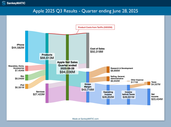
A new Apple diagram is posted, showing their results for the most recent quarter (ended June 28).
In the discussion on the earnings call, Apple specifically noted that their product costs increased $800 million because of new tariffs. I've highlighted that share of product costs in red.
Visit https://sankeymatic.com/data/apple/ to see a more interactive version of the diagram and to make your own variation.
#dataviz #DataVisualization #SankeyDiagram #Apple #AAPL #earnings
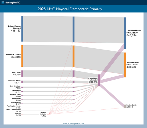
The ranked-choice-voting results are in from the 2025 NYC Mayoral Democratic Primary.
Here's a Sankey diagram detailing how the rounds went. Zohran Mamdani won in the 3rd round, with 56% to Andrew Cuomo's 44%.
See an interactive version (and make your own custom variation) at https://sankeymatic.com/data/newyorkcity-mayoral-primary/
In anticipation of this year’s NYC Mayoral primaries (being held today), I've put together a diagram of the *previous* Democratic primary, from 2021.
See the big version at https://sankeymatic.com/data/newyorkcity-mayoral-primary/#2021-primary
When the 2025 primary results are finalized, I'll add a new diagram to the page.

New on the site:
Quarterly graphs for Microsoft (MSFT).
Here is Microsoft's most recent quarter vs. the same quarter a year before. Besides the $10M increase in Service revenue, the pictures are quite consistent.
See more quarters at https://sankeymatic.com/data/microsoft/
New section on the SankeyMATIC site:
“Data: Interesting Diagrams from the Real World” at https://sankeymatic.com/data/
The first examples there show financial results for companies over time, with the first (of several) being Apple.
You may have already seen such diagrams presented elsewhere in Sankey form.
What's new here is:
1. Each diagram is overlaid on the *same* period’s results from the year before
2. There's a slider so you can compare them. (I'll post an animated example in a thread.)
Hello friends and new followers!
There have been many changes to the website in the last year. I'll post a high-level summary soon, but here are two other ways to get a sense of what's changed:
1. I've updated the header image to show off new examples of what you can do on the site; the old & new images are attached here so you can see some of the differences.
2. You can check out the actual code change history, if that appeals to you, at https://github.com/nowthis/sankeymatic/commits/main/
