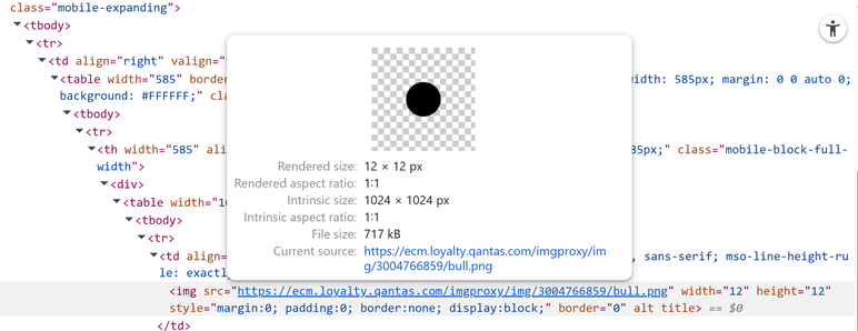
Fun* thing I just noticed, the bulleted list markers in the Qantas "you got breached" email? 717kB PNG file.

@nonspecialist I can at least confidently say that the Azure DevOps documentation sucked long before AI made it worse.
It took me too long to find out how to get pull requests and commits from a card and link them back and I honestly cannot remember how I did it, other than trying random IDs (which one? Yes. But no not that one), until magically I found an API with a query object that had something in the ball park of a related link.
Can thank the enduring legacy of TFS for how a lot of ADO is, why make it better when you can build on sand.
@SonnyBonds @bitbear just to hang it on to here as well as my other reply: what you’re after is more flexible, so long as the parent node can define the virtual space each child has to work with so you might have
list
item::centre
item::left
item::centre
But when it comes time for layout the list has subdivided its available space into 3 for each child, width and height of each is up to you - maybe list has a height greater than its items - so then the centre items would appear in the center of each space allocated.
CSS has sort of become a standard comaprison for layouts even though I find flexbox and grid way too duplicated due to both the parent and child defining locations, but how they work is effectively what I attempted to describe again 😅 Parent defines some “virtual” space partitions with implicit child positioning, then children can make their positioning within those partitions explicit. Hoprfully thats a bit clearer (and you just ignore the 2nd part of what I posted previously 🙃)
@SonnyBonds bus posting on that will do it 😅 Others covered it with the relation to flexbox/grid system from
CSS. Letting child nodes define their position relative to their parent with float:right caused endless grief. Flexbox and grid make per item positioning simplier with the parent creating ‘virtual’ space for each child, effectively making the space a child has to work in a 1:1 relationship. So having align-self or justify-self is easy enough to conceptualise that it’s based on the space the parent has given, and for the most part all nodes can be treated as block elements which are relatively easier to position. Not that CSS is a perfect example of a layout system, but nothing comes close to the sheer use and iterations
The 2nd part was to be an example of when the parent didn’t subdivide its space and left it up to the children to negotiate with each other, and how can a child be expected to position itself within its siblings, and then the siblings having to readjust without the parent providing bounds. It was just not my forte to explaining it.
@SonnyBonds i think from my perspective its more obvious where the contents should be from the container level than the item determining where it should be. An item shouldn’t be aware of its own position in space when it comes to layouting, but it should be aware of the contents it has to display for logical layout behaviour if that makes sense on perspective?
Or for another way of thought, if I have a container UI with 3 elements, with each having control of their own alignment in the order of left, left, centre; does the centre element at the end push itself to the middle and then the 2nd left element is no longer left within its container? Or if there’s runtime ordering how would the layout respond to the centre item being the first item now? What does centre mean in that context? This is when it’s a 1:n relationship from container to children.
Can’t wait for the new UI design for Apple devices.
Not because its cool, but because I have to assist family members with understanding that things just change with no respect to users who can’t see well or adapt to change easily and UI elements pop in and out due to a single pixel of scroll happening.
Maybe the LiquidAss theme won’t suck shit, but it will, because its corporate UI design in 20XX and users are a secondary though to the lowest hanging fruit of appearing to innovate: changing the fucking UI every 6-12 months
WebStorm feels like its taken a massive shit and the LSP for vue seems to just give up with anything, takes ages to realise “oh right, I should suggest an import for that instead of letting the eslint LSP take over first”, this is only in 2025.1 or later, 2024 was fine but progressively getting worse, but not this bad. Feels like the index means fuck all when it takes minutes to finally realise an import is missing, or context suggestions gives me a visible loading box every single time I dare to alt+enter on that fucking red squiggly line.
Out of nowhere I’ve lost breakpoints being attached during runtime and I have to reload the page for WebStorm to register new breakpoints. That just broke out of nowhere so I’ll potentially chalk that up to chromium sucking shit for now.
Going hard on AI is the way to go as a business model just don’t work on big production level code bases I guess. Speaks volumes when I’m contemplating switching to VSCode and its shenanigans just so I can go back to the future where autocomplete and intellisense just fucking worked without any bullshit.
Rider _still_ doesn’t have feature parity with resharper either which is wild. I can let that slide for the most part but cmon, I’m not paying for AI bullshit I’m paying for functional IDEs.