Michael Roesser

@MikeRoesser
5 Followers
164 Following
11 Posts
Bills, Sabres, Mets, Celtics. Just so you know where I stand. Parent to 6 minions. Grades K-6 public school STEM teacher. Yes, I teach all of those grades. Was once (though I probably still am) a MacGenius.
@dmoren Infuriating because someone at Apple clearly created this solution for themselves and people only noticed by accident, or that the notch is a feature no one wanted or asked for, which then caused a problem they have no intention of “officially” fixing or at least mitigating, or ALL of the above? 🫠
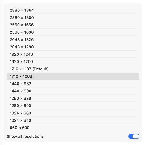
@dmoren Hey. Just listened to the latest Rebound. I couldn't find a menubar app that I actually liked either (after getting my MBA15), so I stumbled upon this suggestion somewhere, where I just killed the notch. You “Show all resolutions" and you select the size, directly below the (Default) resolution. No notch. I'll gladly waste that little bit of screen at the top. Hope that helps.
@paul Hey. Good evening.I know macOS has had a calculator app for some time now, but Calcbot has been on my main IOS screen and on my Mac dock forever. But I'm getting this error in Tahoe. Do I need to move on, or might this be fixed at some point?
@atpfm Not being a developer so not fully grasping the issues developers deal with, with multiple apps, did you consider keeping the old version as Overcast Classic and release the new version as 2.0, and let it evolve over time, or release it as a beta first?
@_MrJasonW @overcastfm I’m also hoping the swipe menu is on the list to make a return to the app; burying everything in the context menu (not to mention the UX drawbacks) is not a great replacement for the swipe menu.
@overcastfm Lastly, keep up the good work. I'm sure I will move to the new version eventually, but adding tiles (or some derivation) to the development timeline would be fantastic, IMO.
@overcastfm With that said, I was able to turn off auto-update on my main device before the new version was pushed out, after trying 2.0 on a spare device. It’s just not usable for me, especially when I’m driving, which is when I use Overcast the most. Minimal taps and not having to aim for small buttons, where previously I could swipe without really looking. Also having the maximum amount of information and options available on screen without requiring extra taps was important to me.
@overcastfm Even with being onboard with the reasoning you laid out on @atpfm for starting from scratch, I wish we could have been given a choice to stay with the old version, with this being Overcast 2.0. It’s just too different (right now) for how I have grown to use Overcast. The flippable tiles were the best feature that I feel set it apart from other podcast apps.
@gruber Toggle the reader view option in settings and it comes back. Then turn it off and it is still there for me.
Twitter

Twitter