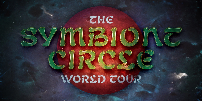
I always wondered— do potential customers of fonts like these “waterfall” demo images, or is it something type designers just love to make?
Anyway, here’s Atencio.

| Aurebesh Font Archive | https://aurekfonts.github.io |
| Pronouns | he/him |
| Tips | https://ko-fi.com/aurekfonts |
| Formerly | https://twitter.com/AurekFonts |
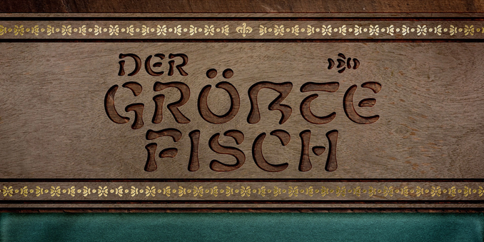
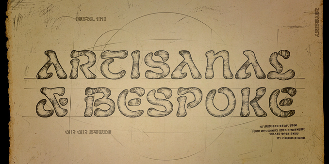
I always wondered— do potential customers of fonts like these “waterfall” demo images, or is it something type designers just love to make?
Anyway, here’s Atencio.
RE: https://typo.social/@crown/116163327225121099
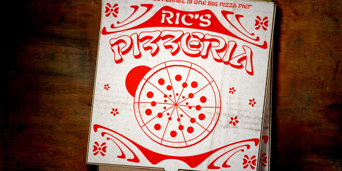
Atencio is a modern revival of Rubens, a late 1800s style, often used for books, films, and ...theme park attractions. This is the first font of this style to have a variable weight and this level of draw quality.
It’s not finished yet, but it’s also priced as such. As we develop it further, the price will go up from $60, so now’s not a bad time to get it if you want to receive future versions and support its development. The price will never be lower than it is now.
https://crowntype.com/atencio/
Really proud to release Atencio, a Rubens revival with four weights and a variable axis. It’s a work-in-progress, but I hope it’s useful already!
When it comes to naming fonts, something I suspect everyone dislikes doing—
When do you decide to care that another font exists with a desired name? If it is from a foundry you know? If it’s in a major font marketplace? Do you disqualify lower-quality fonts with a desired name? Do you ignore all the “etsy millennial script” fonts that inevitably use every name imaginable? When do you prefix or suffix with your foundry’s abbreviation? When do you say “fuck it” and name it whatever you want anyway?
@tvaziri I love seeing this article get longer every time I see it.
(I also noticed a small typo: Under "Ted" you have Framestore as "Franestore")
Anyone know how to do a perspective-style warp in photoshop or illustrator without moving any pixels vertically?
I want some pixels to travel left, some to travel right, and none to travel up or down, so that two lines of text remain the same height as before the distortion.
✍️ Creating a new (old) font, testing it out by making a Wicked logo.


