This is an NTSC color wheel, in SVG.
I'm contemplating a chapter on composite artifact color. The problem is I have to teach the material to myself first.

This is an NTSC color wheel, in SVG.
I'm contemplating a chapter on composite artifact color. The problem is I have to teach the material to myself first.
Just arrange a bunch of colored circles so they overlap, then gaussian-blur the shit out of them.
So this isn't like, strictly correct in the way it would be if you rendered in in Mathematica, but uh, I guess don't cite this in your doctoral thesis, and we're all good here.

If you're an old fart, you might remember this.
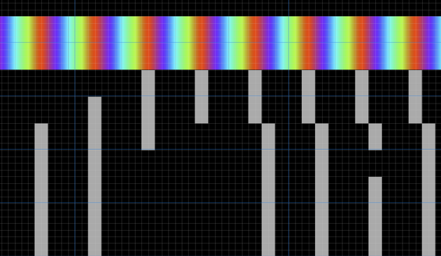
This is the SMPTE test pattern. Well, one of them, anyway.
You might see this if you got drunk and stayed up to 2 AM watching PBS.
It's weird explaining to people that like TV channels used to just ... go to bed. Imagine YouTube being like aight it's 2 AM we're kinda eepy over here , see you tomorrow at 8

To create the color bars at the top of the SMPTE test pattern we follow a particular trail across the color wheel.
Start at yellow on the left, then head to cyan, and just follow the lines, you'll reproduce the pattern.

The CGA's dot clock is exactly 4x the NTSC color carrier clock. That means four pixels can fit into one revolution of the NTSC color wheel, but they take their own particular path.
If I show you these pixels relative to the color carrier, can you guess what color pixels they'll turn into on a composite display?


The Apple II is another system with artifact color, but it looks very different than the CGA.
The Apple II is well known for four primary artifact colors: blue, orange, green and purple.
Welcome to the YIQ color space!
https://en.wikipedia.org/wiki/YIQ
Besides the I and Q components, we have Y, which stands for Yo, what the shit is this stuff so complicated for
But why are the Apple II and CGA different lookin'? Well, very different designs.
The CGA just yeets out 912 pixel wide scanlines of which 640 pixels are typically visible, all in the same phase. In composite mode that gives you the same 16 colors, all the time.
Apple II's hi-res mode, which is really what i'm talking about here, is more complex in operation. There's lower color resolution, but you can change the phase offset mid-scanline!
The CGA might not have had that bad a rep as bein the most bitchin' ugly video card of all time had composite displays been more popular.
But they were a non-starter for Serious Businessing. Nobody wanted to do a Lotus 1-2-3 spreadsheet with a bunch of blurry as hell numbers.
Here's an old analog vectorscope - does that pattern look familiar?

here's your vocabulary word for the day:
The NTSC color cycle starts a rollin' cross your screen starting with yellow at 180 degrees because why not.
So you might expect the pattern '1000' to emit , well, yellow.
Instead we get poo brown.
Look, I'm not trying to be crude, but tell me that isn't poo brown.

But what IS brown, anyway? Is it even a color? shit's very philosophical.
if we use our eye-dropper, we can see that poo brown is actually .... wait for it...
dark yellow.

much about human color perception makes absolutely no sense from like an objective standpoint.
why doesn't every other color turn into some weirdass different color when it gets darker? yellow's just like i'm gonna be brown now. hold my beer.
As you might expect, the patterns
1010 and 0101 are both gray.
But they're not quite the same gray.
Go figure that one out.


You can support this channel on Patreon! Link below This video discusses the color brown. Seriously.That Aging Wheels playlist:https://www.youtube.com/play...
@gloriouscow
Or olive!
Brown is dark orange.
It does somewhat depend on what colour model you use and your video system.
Aligning and calibrating RGB and PAL CRT video monitors. Three tube cameras too. Tedious.
Then single vidicon tube stripe filter alignments and the awful PAL colour on Philips N1500, N1700, Betamax and VHS, though NTSC was worse.
@gloriouscow hey who said the sky is blue? It’s cyan, fight me
Next you’ll be telling me the sun is yellow and Neptune is blue?

Coldplay - Yellow is taken from the debut album Parachutes released in 2000Newly restored 4K version of the video added 10 July 2020.Subscribe for more conte...
remind her nothing is real. nihilism is the gift that keeps on giving.
@gloriouscow look, if you want your computer to give you lots of brown colors, then you buy a Commodore 64.
the NTSC colors are the Apple II colors so I have some nostalgia for them, but the brown is gross, the yellow is murky, and you're also glossing over how mind-searingly off-putting the "aqua" color (1011) can be
Was VGA's 320×200 256-color mode used for Serious Businessing? With its low resolution, high color, chunky pixels, and mutable palette, it seems designed specifically for games.
If they'd thrown in a tile and sprite generator, I'd say it was *definitely* for games, but even without one, it's pretty game-ish.
@argv_minus_one I love watching old ads where people are actually giving reports of sales figures and stuff in 320x200.
If they did it in CGA I'm sure they did it in VGA. But 640x480 was probably more Businessy.
Yeah, that's what I was thinking. Only 16 colors, but loads of pixels, and the pixels are square (640×480 is 4:3). Kind of important for drawing pie charts and whatnot.
Yeah, SVGA was when all the PC video jankiness decisively ended. SVGA chips could do everything: 24-bit direct color at arbitrary resolutions, 8-bit paletted color at arbitrary resolutions, linear frame buffer, high resolution, selectable refresh rate, the works.
@argv_minus_one @gloriouscow It was a very very monochrome world before the early 1990s, both in business and Macintosh
Home PCs with gaming had colour a bit earlier, maybe 5 years — before that, before the 386 era it was mostly Amigas, Commodores, Ataris where you’d see any colour … Apple II as well, but when going back to the early 1980s it was more often monochrome monitors too. At least with the first-party displays. Anyone could throw a TV on it but that wouldn’t look professional enough in business or a school lab. (Before my school’s first lab, each classroom did get an Apple II with a TV on top though).
@gloriouscow @argv_minus_one Fond CGA memory: THIS GUY WANT A LIBBED, LUBED LUBBER!
(chorus) WHAT A PERVERT!!! 🧔🏻♀️🧕🏻💂🏻🧑⚕️🧑🏻🍳
@lritter @gloriouscow hmm thanks 🙏 that’s a better link to theoretical basis than I’ve usually seen
It’s usually this sort of “magic number” guff that I see
https://media.geeksforgeeks.org/wp-content/uploads/20211110163719/Screenshot2459-300x267.png

@lritter @gloriouscow Lossy compression, even if you hate it, provides a fascinating insight into your perceptual model and any flaws it has!
I was always fascinated how, in standard def days, red chroma was so sensitive to 4:2:0 subsampling (especially within interlaced sources). This had nothing to do with your bitrate or codec, since 4:2:0 was to blame.
But of course that’s disingenuous — any aliased upsampling (back to 4:4:4) of the subsampled 4:2:0, should have been replaced with a gradiated upsample — smooth scaling, right?
But that’s STILL not the full story! Why was red so susceptible? Green and blue, when ramping to and from black, never suffered this way. But WHY?
And the uncomfortable truth emerges … we’re doing colours wrong. We’re even just NUMBERING it all in a way that we shouldn’t be.
And it slowly dawns on you that adding up R+G+B can never be optimised. And that splitting luma and chrominance is The Way.
But that way lies mathematical pain.
So I like your YCoCg. I only knew about YCrCb versus YPrPb.
And of course CIE. But I’d love to define the units on the 1931 diagram 😝 it’s a good test to measure the model size of an LLM, actually.
@gloriouscow Back in the late 80s I wrote a small Basic program to display the color bars on my TRS-80 CoCo 2.
The CoCo MC6847 "Semi-graphics" mode seems to have (almost) the right color palette.


@gloriouscow "TV channels used to just ... go to bed."
New Zealanders over a certain age will now be thinking of The Goodnight Kiwi


