This is an NTSC color wheel, in SVG.
I'm contemplating a chapter on composite artifact color. The problem is I have to teach the material to myself first.

This is an NTSC color wheel, in SVG.
I'm contemplating a chapter on composite artifact color. The problem is I have to teach the material to myself first.
Just arrange a bunch of colored circles so they overlap, then gaussian-blur the shit out of them.
So this isn't like, strictly correct in the way it would be if you rendered in in Mathematica, but uh, I guess don't cite this in your doctoral thesis, and we're all good here.

If you're an old fart, you might remember this.
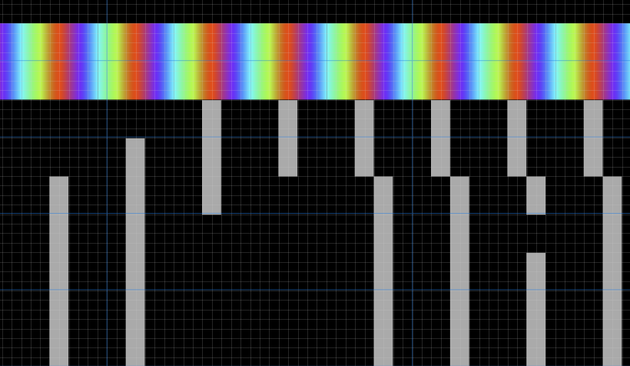
This is the SMPTE test pattern. Well, one of them, anyway.
You might see this if you got drunk and stayed up to 2 AM watching PBS.
It's weird explaining to people that like TV channels used to just ... go to bed. Imagine YouTube being like aight it's 2 AM we're kinda eepy over here , see you tomorrow at 8

To create the color bars at the top of the SMPTE test pattern we follow a particular trail across the color wheel.
Start at yellow on the left, then head to cyan, and just follow the lines, you'll reproduce the pattern.

The CGA's dot clock is exactly 4x the NTSC color carrier clock. That means four pixels can fit into one revolution of the NTSC color wheel, but they take their own particular path.
If I show you these pixels relative to the color carrier, can you guess what color pixels they'll turn into on a composite display?


The Apple II is another system with artifact color, but it looks very different than the CGA.
The Apple II is well known for four primary artifact colors: blue, orange, green and purple.
Welcome to the YIQ color space!
https://en.wikipedia.org/wiki/YIQ
Besides the I and Q components, we have Y, which stands for Yo, what the shit is this stuff so complicated for
@lritter @gloriouscow hmm thanks 🙏 that’s a better link to theoretical basis than I’ve usually seen
It’s usually this sort of “magic number” guff that I see
https://media.geeksforgeeks.org/wp-content/uploads/20211110163719/Screenshot2459-300x267.png

@lritter @gloriouscow Lossy compression, even if you hate it, provides a fascinating insight into your perceptual model and any flaws it has!
I was always fascinated how, in standard def days, red chroma was so sensitive to 4:2:0 subsampling (especially within interlaced sources). This had nothing to do with your bitrate or codec, since 4:2:0 was to blame.
But of course that’s disingenuous — any aliased upsampling (back to 4:4:4) of the subsampled 4:2:0, should have been replaced with a gradiated upsample — smooth scaling, right?
But that’s STILL not the full story! Why was red so susceptible? Green and blue, when ramping to and from black, never suffered this way. But WHY?
And the uncomfortable truth emerges … we’re doing colours wrong. We’re even just NUMBERING it all in a way that we shouldn’t be.
And it slowly dawns on you that adding up R+G+B can never be optimised. And that splitting luma and chrominance is The Way.
But that way lies mathematical pain.
So I like your YCoCg. I only knew about YCrCb versus YPrPb.
And of course CIE. But I’d love to define the units on the 1931 diagram 😝 it’s a good test to measure the model size of an LLM, actually.


