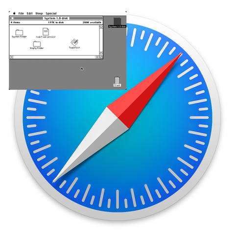
I made this a few years ago, to compare the size of the entire screen on an original 128k Mac with the size of the Safari icon on modern macOS. Enjoy!

@thomasareed

Whoa, when did they switch to 1024x1024 icons?

For years and years, I had a Palm OS screenshot inside of a Mac SE screenshot inside of a Windows 95 screenshot, just to see the progress.

@rl_dane @thomasareed I assumed they were vector . Surprising!

@evert @rl_dane @thomasareed

*makes 1024x1024 vector image*

@evert @rl_dane @thomasareed Yeah, same. They might still include bitmap exports of varying sizes for an icon set, but I'd assume the core is all vectors these days.

@glennseto @evert @thomasareed

Probably vector in the original design, but everything was still bitmap-slinging last I checked.

The only OS that used true, pure vectors for everything was IRIX, AFAIK.

@glennseto @evert @rl_dane @thomasareed Mac OS X initially used PDF for a lot of icons, because its imaging layer came from NeXTSTEP, which was based on PDF. (Which in turn was because Steve didn't want to pay royalties to Adobe for Display PostScript.)

For example, /System/Library/CoreServices/Dock.app/Contents/Resources used to have the PDFs for the dock's icons, like `poof.pdf` for the cloud animation when you dragged something out of the dock. There are still quite a few PDFs for UI elements under /System, but the number has been going down as successive redesigns have taken place.

@mathew @glennseto @evert @thomasareed

I had no idea! Well, I only used OSX from 10.5-13, so I probably missed some important bits.

@thomasareed why is the red tip off center of the dial marker? 😫
@chrisvest @thomasareed relax the gray side is also of center... but not in a way you would expect it if it's just rotated around the center. So the entire needle is slightly of center to the compass frame. 🙃
@chrisvest @thomasareed
Parallax. Balanced by the drop shadow.
@thomasareed the days when even the absence of every pixel counted.
@wiert @thomasareed around 1990 I accidentally discovered I could scramble my video memory by running a screwdriver along the back of my video card, which meant I could watch how the screen got redrawn. (Before GPUs, so the CPU wrote to the video memory.) Watching Star Control, which was not new and ran in 320x200, redrawing the screen with minimal writes, so the background starfield traced at least a dozen lines through the static, I was impressed
@ShadSterling @thomasareed wow, that's a cool means to learn how software works.
@thomasareed it reminds me of rebound effect where processors and memory are getting better but systems are still slow
@thomasareed its even wilder to think that safari icon is probably bigger than the original 400KB floppy that system 1.0 shipped on
@Yuki @thomasareed the whole .icns file which contains multiple sizes of the icon is 2.3MB so you can fit quite a few floppies in there 😅

@thomasareed

I remember this from when those new icon sixes were announced. And I remember when those Macs had such as impressively crisp and clear screens. (After, say, an Apple ][e, the pixels were basically invisible.)

@thomasareed And yet the icon has less information density than the old icons. @isotopp
@rotnroll666 @thomasareed @isotopp co je pětkrát větší, může být trochu řidší..
@thomasareed I was surprised at the time that they went to so much trouble making raster images to imitate simplistic vector graphics. With the subtlest of deviations to entertain pixel peepers.

@thomasareed

I'm…really not sure why they don't just use SVG for icons at this point.

Earlier versions of Mac OS X had beautiful photorealistic icons that would have been difficult to make in SVG, but this is not that. This could be vectorized easily.

@thomasareed Guess future proof. Surprised not SVG at that point though.