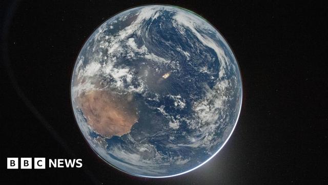
As I suspected, media are getting very confused about that #Artemis II Earth image, thanks to NASA’s poor original captioning.

This BBC article shows it as “Hello, world” without knowing / noting that it’s the dark side, illuminated by moonlight.

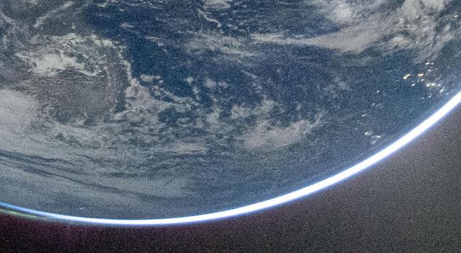
Then lower in the article it says NASA later released another image, this time showing Earth in near complete darkness with city lights.

Edit: not exactly the same image, but 19 sec apart with different exposures.

https://www.bbc.co.uk/news/articles/ce8jzr423p9o

Artemis II crew take 'spectacular' image of Earth

The snap was taken aboard the Orion capsule by its commander, Reid Wiseman, as the crew head towards the Moon.

BBC News

The article even quotes the astronauts as taking the images illuminated by moonlight, saying that setting the exposure was hard, but the writer didn’t make the connection.

Or that you simply wouldn’t see the aurorae or stars, even Venus, in a short exposure that captures the sunlit dayside Earth.

In a world completely saturated with images taken & displayed by handheld computers, it still amazes me how poor people can be at interpreting them critically.

Which means we’re AI-doomed.

@markmccaughrean

Most people have zero understanding about the relationship between exposure, aperture, film stock speed / sensor gain and subject brightness. It's been like this since the early days of auto-exposure point & shoot cameras. And then of course a lack of understanding of illumination (diffuse vs. direct, effects of albedo, etc. etc.)

Hence the decade of Moon hoax conspiracies hinging on a misunderstanding of the Apollo photographs.

@markmccaughrean

It takes actual photography knowledge and experience to properly appreciate these photographs.

And if you have that knowledge you do not even need the explanation. When I saw this picture for the first time I went: "Huh, that looks interesting. No strong specular reflexes on the water, so this is much lower illumination contrast from what to expect in sunlight. Oh look aurorae. And city lights? This got to be cranked up exposure and moonlight illuminated. Neat!"

@datenwolf I fully agree with you about photographic expertise (& not in full auto mode 🙂) being helpful, but I’ll quibble about the lack specular reflections being a giveaway 🤪

I mean, surely the illumination conditions are identical, with a 0.5° source lighting the scene from almost directly overhead, but just 400,000 x fainter because it’s the Moon instead of the Sun.

I suspect it looks flatter because the quick processing didn’t set the black & white points carefully 🙂

@markmccaughrean

Ah, yes… the angular size of the Moon and the Sun are identical, and they're both fairly uniform area light sources, so yes, the normalized specular reflex term is identical. However, when coming from the Moon the light is much fainter, so the overall contrast is lower, compared to light not coming from the Moon, especially in regions close to the horizon where you have light spilling through atmospheric scattering from the Sun.

1/

@markmccaughrean

Add to that, that our eyes, but also image acquisition systems compress the dynamic range and have finer resolution toward "darker" signals, although the difference might look "not significant" in linear terms, it becomes quite pronounced at lower light conditions.

A many papers have been written on this in the area of computer graphics and accurate rendering of atmospheric scattering.

@markmccaughrean

I love this part of the picture: Here you can clearly see, that all of Earth's atmosphere contributes significantly to light scattering. The troposphere and stratosphere are much thinner than the band of light spilling over you can see here. The aurorae and airglow are happening at the top of the much higher and vastly less denser mesosphere, so here you have a pretty good "scalebar".

@datenwolf That non-linear response is certainly true of the human eye, but DSLR CMOS sensors are pretty linear AFAIK, & it’s something we strive for (but can’t always have) in our astronomical imaging systems, to ensure we get good flux calibration. But I’m not familiar with more generic terrestrial image acquisition systems, where deliberate non-linearity may have some benefits.

@markmccaughrean

Image sensors are pretty linear; there's a quantum efficiency that tells you the probability of an electron getting knocked loose by an incoming photon. Typical values are ~0.6 to ~0.8 for standard sensors. However, unfortunately with CMOS there's huge variations even between neighboring photo sites (this was much less of a problem with CCD), so at the least you need an calibrated equalization step as part of post processing. 1/

@markmccaughrean

Furthermore, the readout amplifiers of CMOS image sensors are inherently nonlinear, since they're basically just single FETs without any kind of linearizing feedback (as you'd have in a full blown OP amp). So that's something to account for as well.

A few years ago we had an engineer of a CMOS sensor vendor giving a seminar talk here, breaking down all the processing.

Sensors used in astronomy are different. I did my graduation thesis on their use for particle detection.

@datenwolf Yeah, my PhD thesis almost 40 years ago was all about infrared imaging arrays & had a whole chapter on the inherent non-linearity of CMOS detectors as used as the electron collection & read-out circuits under infrared sensitive pixels, & how to correct for it: quite different to CCDs. And obviously also calibrating & removing the pixel-to-pixel differences in QE, dark current, etc. – observational astronomers know this stuff pretty well 😉

@markmccaughrean

It's also South Pole at the top, North Africa in the lower left, with Iberia (Europe) below it.

Also, the Apollo XVII image in early Dec, while Artemis II is early April. Almost 4 months difference in terms of axial tilt.

@gnoll110 Yes, sure, & that much the BBC article gets right 🙃

@markmccaughrean

I've seem the image rotated on other sites.

@markmccaughrean @derpoltergeist Actually, it is not the same image. Exposure time and aperture between both images are different. Maybe the post-process as well, but it started with the actual photo
You can check EXIF data
Light mode https://images.nasa.gov/details/art002e000192
Dark mode https://images.nasa.gov/details/art002e000193
NASA Image and Video Library

NASA Image and Video Library, serving up consolidated imagery and videos in one searchable location. Users can download content in multiple sizes and resolutions and see the metadata associated with images, including EXIF/camera data on many images.

NASA Image and Video Library

@elpalabrista @derpoltergeist I'll admit, I did wonder when I made that assertion, but wasn't near a computer to check properly: thanks for doing so.

19 seconds apart, the dark one first with 1/15 sec at f/5.6, the light one 1/4 sec at f/4, both ISO 51200.

And there's some rotation between them.

But same underlying lighting conditions, which I guess is the main thing.

And NASA really should have said that the light image was also a darkside / night time shot – that's where the confusion is.

@markmccaughrean @derpoltergeist I agree, NASA should have made it clear, for even more astonishment. Is incredible
@elpalabrista @derpoltergeist Personally, I don't think the social media knew – surely the astronauts did, as they talked about it, & I imagine someone on the ground processed it & knew (or did they? at ISO 51200, perhaps that's straight out of the camera), but someone nearer the end of the pipeline didn't realise what gold they had in their hands.