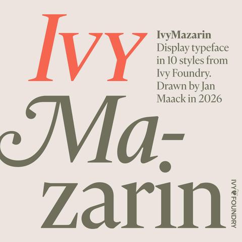
IvyMazarin just launched.

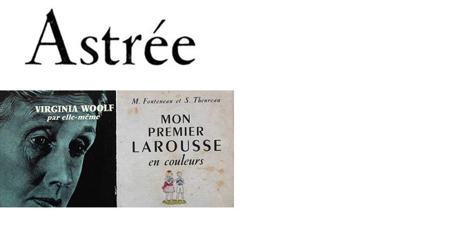
Mazarin was licensed by Stephenson Blake in 1926. Originally called Astrée and designed by Robert Girard. Published by Deberny & Peignot in 1923.

It was quite a difficult project because there were so many variations of the same letters in Mazarin, Astrée and L'Astrée.
Even within the same page in Mazarin there could be two or three versions of a letter. I liked many of the original quirks of the letterforms and am keeping some while changing others.

I owe a big thank you to @FontsInUse for helpful background history and links. Also, a big thank you to the good people at The Type Founders. And thanks to @letterformarchive for photoscans that I could compare to my own specimens.

See more IvyMazarin → https://ivyfoundry.com/

@janmaack Congratulations! Super nice to see it! Really like the italic.
@janmaack @letterformarchive Gongrats, Jan! Happy to hear you found our record helpful: https://fontsinuse.com/typefaces/44829/astree
Most of the historical facts are thanks to the research conducted by @PaulShaw for A2-TYPE in 2019: https://a2-type.co.uk/a2-mazarin/more-info
Astrée in use

Started around 1913. Designed by Robert Girard, engraved by Paul Bourreau, and cast by Pochet. Released by Girard & Cie in May 1923, immediately before the merger with G. Peignot et Fils into Deberny & Peignot, initially in roman and italic, accompanied by titling capitals. A bold followed in 1930. The roman came with small caps, ligatures, and some swash terminal forms (for ‘e’, ‘t’), while the italic had alternate swash caps. Astrée was adopted for the Linotype in 1926. A licensed copy was issued by Stephenson Blake in 1926 as Mazarin. [Shaw] Mazarin has some differences, including replacing Astrée’s unusual ‘r’ with a more conventional form. Digital interpretations include Servane Vignes’s Astré (2017, unreleased), Henrik Kubel’s A2 Mazarin (2017), and Jan Maack’s IvyMazarin (2026).

Fonts In Use