📱 New member special! 📱
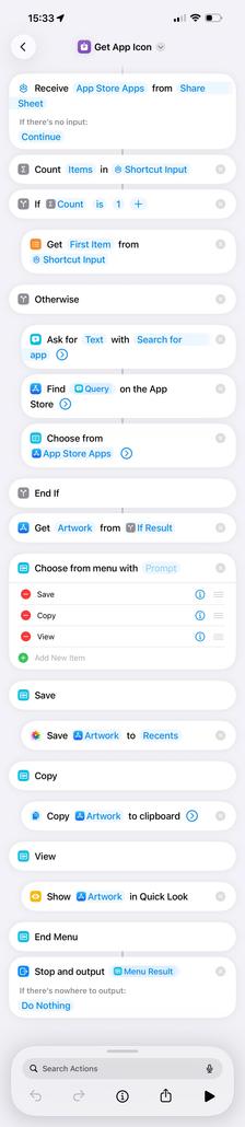
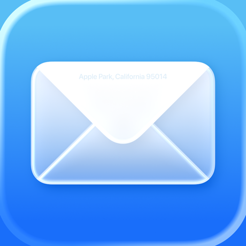
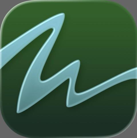
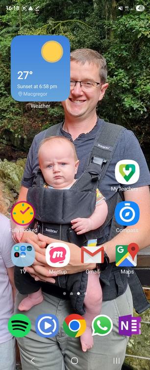
ATP Tier List: Home Screen Icons
https://atp.fm/atp-tier-list-home-screen-icons
Ranking the app icons on our iPhone home screens, including built-in Apple apps, third-party apps, and — somewhat awkwardly — even our own.
Join now to listen! https://atp.fm/join