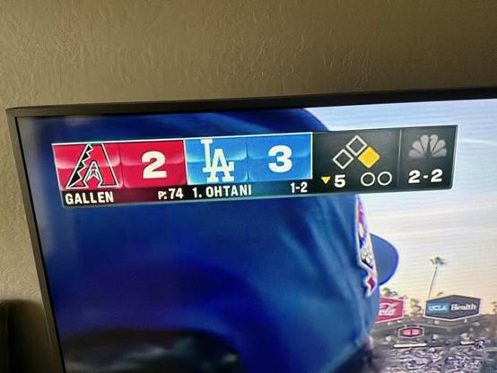
NBC scorebug: look, yellow for base runners. Yes. Two out dots is bad though. The weird texture on the team logos is comical. At least I can read the player names.
@jsnell It’s weird that the balls and strikes are separated from the outs by a frame barrier, but sitting right underneath the peacock logo. Balls and strikes? Good! Peacock logo? Fine! This arrangement, though, is the work of someone who doesn’t know baseball and doesn’t try to find out.