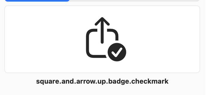
I am increasingly convinced that this low-context naming system is the only one that makes sense for icon sets beyond ~500 glyphs. it runs circles around having to guess names like “share success, share complete, share check, confirm share, share confirmation, shar

@samhenrigold i love material icons because there is an icon called "bubbles"

it is tagged with "Abstract, airy, app, arrow, arrows, background, bath, beverage, bubbles, carbonation, champagne, chemistry, circles, cleaning, close, collapse, decorative, design element, direction, down, drink, effervescence, fizzy, floating, foam, graphic, interface, light, liquid, pattern, playful, right, science, soap bubbles, soda, spheres, ui, ux, visual effect, window"

it looks like this

@tay @samhenrigold I was just gonna say, having worked with Material Symbols recently, the SF Symbols naming conventions make things so much easier to find.
@samhenrigold i think all icon sets should be labeled like this. Especially at work, I’m sick of trying to remember what arbitrary label the art director put on something, when none of the words say what the elements of the icon actually are.