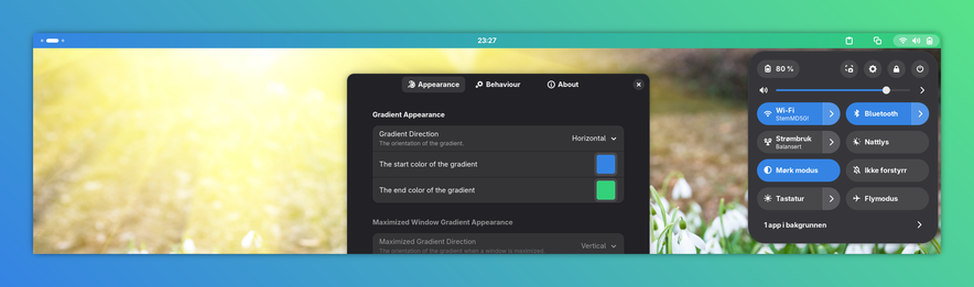
I honestly think #Gnome with gradient accent colors could look pretty sick! If implemented with the correct colors and fading between them, of course.
I have no idea how I would make a mockup showing this, so I'll just show a screenshot of a gradient in the top bar (accent colors does not affect the top bar, this is just the only thing I found an extension for changing to a gradient) on one of those gradient color backgrounds from Gradia.
What do you think? Ideas for colors that could work?