RE: https://mastodon.social/@gruber/116261867124540631
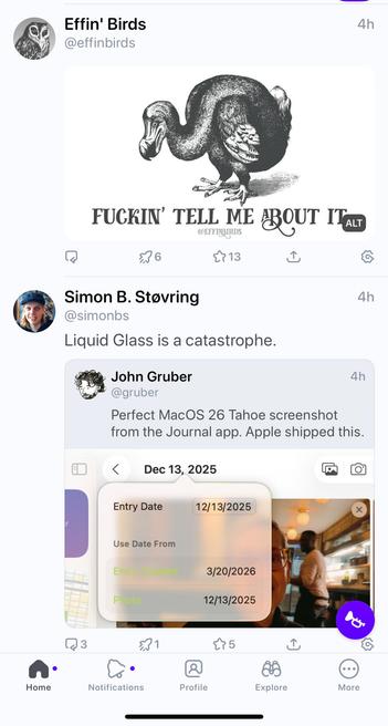
Liquid Glass is a catastrophe.
RE: https://mastodon.social/@gruber/116261867124540631
Liquid Glass is a catastrophe.
@simonbs @gruber the thing about modern Apple UI is they go for some deeply flawed vision that seems developed in a vacuum away from third parties, accessibility experts and engineers, and then when that fails they water it all the way down until people say “huh okay this isn’t that bad any more”
it just lurches from catastrophe to milquetoast and back again, with most of the time firmly in milquetoast territory
what i’d love, love to see is them - or anyone - come up with is a system vision that bakes in accessibility and pro / studio app design first. There’s a million design systems and frameworks that make a great recipe app, but get them to make an outliner or a DAW and it all goes pear shaped. Design system on the pro apps first, high density, pluggable, powerful, legible. *Then* do the simple stuff.