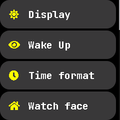
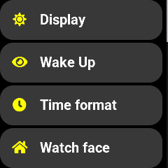
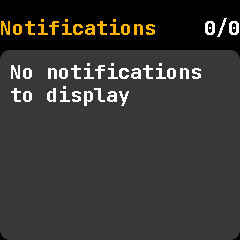
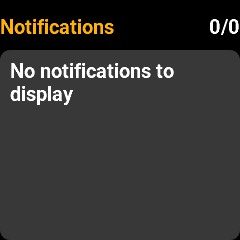
I should probably have done this years ago, but here's my latest work on PineTime's font rendering.
Anti-aliasing, kerning, subpixel hinting. Dropped the monospace font. Looks so crisp on the watch's display!
Before and after: