I’ve seen the first evidence that someone who understands user interaction is driving the bus at Apple.

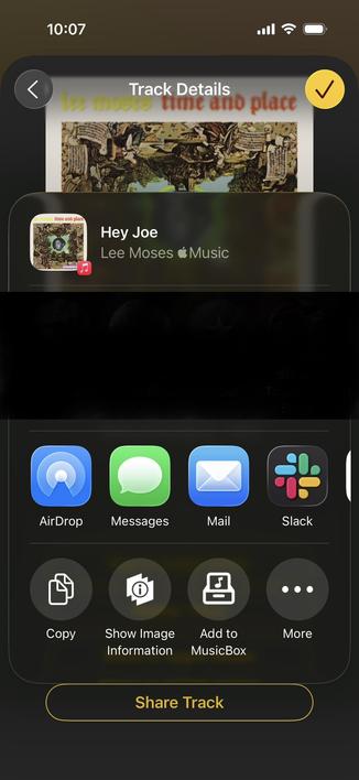
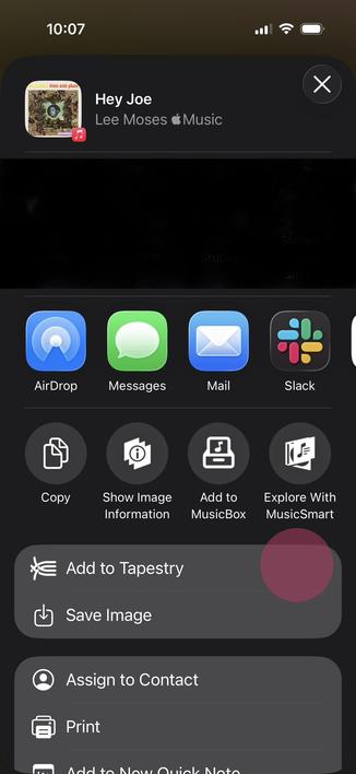
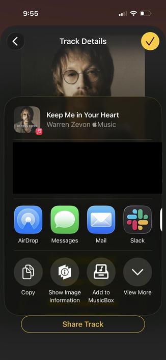
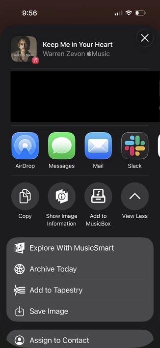
In the first release of iOS 26, the system sharing sheet had a More … button to expand the sheet (first image). The problem was that as soon as you pressed that button it was replaced by another action, which you were unlikely to see because your eye was focused in the tap area (red highlight, second image).

Confusing because what I was looking for was not in the expanded area!

1/2

In iOS 26.3, the morphing “More …” button was replaced by a much simpler and more obvious “View More” and “View Less”.

The collapsed and expanded states are shown below.

I hope we see more of this - optimizing for screen real estate when there’s a high cognitive cost just isn’t worth it.

Buttons should act like they have for centuries, not like some magical thing a designer dreamed up.

2/2

@chockenberry yay for the sign. very nay for the fact that this existed and made it in any public build at all though.
@monkeydom I couldn’t believe it when I first encountered it in the beta. Didn’t do an FB because it’s obviously wrong…