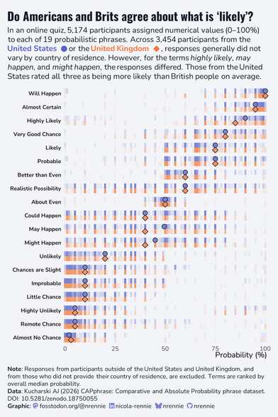
A really fun dataset for this week's #TidyTuesday, looking at how people interpret different probabilistic statements 📊
There's so many aspects of this to visualise, but I decided make some barcode plots comparing how people from the UK and US responded. It seems we're much the same with the exception of may/might happen and highly likely - where our American friends are more optimistic!
Code: https://github.com/nrennie/tidytuesday/tree/main/2026/2026-03-10