Hey #reading and #writingcommunity and #bookstodon people, I have a cover and title question

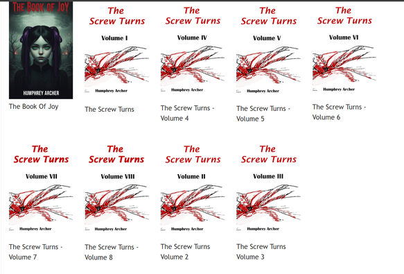
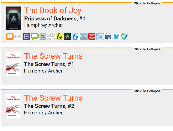
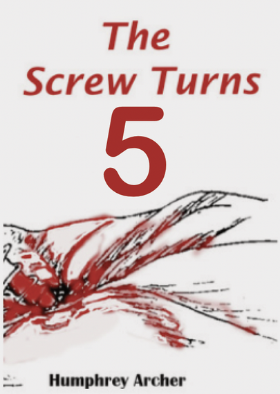
My fiction work is mainly short story collections. I publish the shorts when the pile of completed work reaches around 50k words, and thus far, have kept the same cover and title, and just incremented the volume counter.

Keeping the cover static saves a ton of cost and time, but in the D2D views, the Title and collection being the same may be hard for #readers to tell them apart.

Any thoughts?

@screwturn I have thoughts, but what's the question? Are you considering reworking the covers?

@knbrindle
I was hoping some brainy person would blurt out "yeah, here's ho to deal with collections and many volumes" :)

But topmost thoughts are
- can I avoid having to vary the covers (because that is a big schlepp)
- is there a better way to distinguish the title of each collection than "volume #"
- is there a smart way to give each volume a unique name and keep the same series name

My novels are all part of a "Princess of Darkness" series, but each is unique enough to get its own title

@screwturn

Well, I'd consider maybe doing something like this:

1. Remove the "volume" from the cover, because more words == more things the same.
2. Make the volume number the most prominent thing on the cover.
3. Ditch the roman numerals... they're difficult to differentiate to the uninitiated, and even those who know how to read them might trip over them in small fonts

@screwturn

But barring cover changes, it looks like you are using the Series and Volume Metadata fields... beyond that, I'm not sure what else you can do but change the titles.

You could do a "subtitle" for each volume. I think the typical format is something like

"The Screw Turns: The Turnening”

But then, I'd also expect to see that on the cover so 🤷

@screwturn I have a couple!

1. You can use a color field to further differentiate them. ACOTAR does this quite boldly. (see first image + alt)

2. I've seen this one only rarely, but spreading one image across all the covers of the series to they fit together. I bashed together a super rough mockup with some random stock art to illustrate the concept. (see second image + alt)

@joshsutphin
Holy fuck, #2 is an amazing idea! That would never have occurred to me in a century
@screwturn I really wish I could remember the title or author of the series I first saw this technique used on. I *think* it was a series of academic books on human anatomy but I can't remember enough text-searchable details to successfully find it again. 😭 But it looked *so good*.

@screwturn

1) They are really difficult to tell apart.

2) As a potential reader I wouldn't know, what content to expect

Suggestions for 1:
Use of different colors and the volume counter much bigger (so it is part of the motive)

Pictures of different arranged screws (the good thing is a big variety of these).

Or arrange the curly swirls in different angles (since the screw is turning)

Suggestions for 2:
Stories / Short Stories ...
Genre might be nice to know, too.

@muenchnerin
Would you want that on front cover or on the back?

Genre is very tricky for me because I straddle several - horror/thriller/mystery/noire/dark-satire.

The short stories are all "Final Destination" meets "The Monkey's Paw", but vary in a lot of specifics. Today My Dude is murdered by an angry crow, tomorrow he is centrifuged into liquid in an industrial washer, the day after he slips and dies because of a cleaning robot.

No core theme

@screwturn

As someone who usually reads e-books: I usually only see the front cover. The text which is on the back usually is in the description, but not shown in any overview ... (and possible design of back cover or spine are unluckily lost for us e-book connoisseurs)

If you can't genre (is this a verb?) your stories more precise - your main theme seems to be mostly dark? So I would put each design on a dark background.

Text:
The Screw Turns
Volume 5
Dark Stories
Humphrey Archer