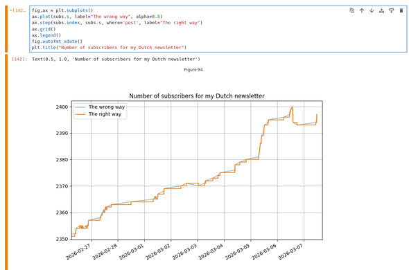
I read graphs like other people savor fine wine. And I'm in a pedantic mood today. So here's the thing, if you plot discrete numbers, like subscriber counts, use a *step* graph. Your subscriber count does not smoothly go up by 1 over a 12 hour period! The step graph shows what is actually happening & when:

@bert_hubert hey, that's a valid approach if you get a new data point *whenever* something changes. (which it looks like that's what's happening in your graph.)

But if the data points are measurements describing something integrating over time and you just sample that once in a while (periodically? aperiodically? specific cond.?), just using step plots lies at least as much as an interpolation (not necessarily a linear one, though) between points. It all then depends on *how* you'd like to lie.

@funkylab @bert_hubert This is closer to my reaction - if I saw the "wrong way" (but should be marked with points) I would assume that the sampling was just irregular (only taken at every point) and that the actual event (subscription action) timestamps were not accessible.