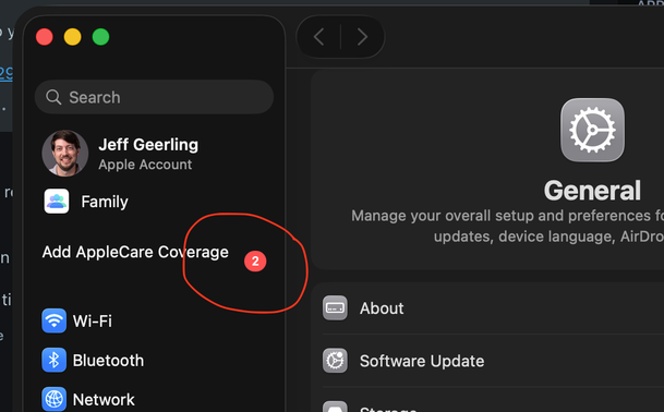
macOS Tahoe is still full of annoyances like this: a notification inside *System Preferences* that cannot be gotten rid of, and it causes the list to look janky, with weird spacing for the list item and a misaligned "2".

I'd be happy with Classic or Aqua over 'Glass'

@geerlingguy [zooms in: “add Apple Care”] looks like you can pay to have this one go away. Hehe. Funny how that works.

My current “Software Update Available” notification is properly aligned and it even has less space to the right of the text. I don’t even have a clue about why this would happen.

I’m sure it’ll all make sense when the MacBook with touchscreen comes out. It’ll still have all kinds of issues, but it’ll nominally make sense.