Me and my fiancée are trying different shading for my next illustration. Just a draft, but which one do you guys prefer? Left or right? :)

#MastoArt #Illustration #WIP

@NIGHTEN

Right. It looks more like natural sunlight streaming through the window.

@NIGHTEN I loooove th eright one. the light and shadow feels very alive
@NIGHTEN definitely the one on the right. The lighting is alive and has depth on that

@NIGHTEN

left, because the sunstreaks on the right look like they've been made with an eraser.

this isn't meant to be harsh, it's nice artwork either way

@Captain_Jack_Sparrow Oh this is just a draft to get an idea of the values and colors to use 😄 I’ll redo the whole light later on
@NIGHTEN
My phone is still in bedtime mode, so looking at them in greyscale, the one with the ray of light looks much better :P
@NIGHTEN Right. Cool! (Or rather warming!)
@NIGHTEN
Left. For me, the sunbeams on the right catch my eye too much and distract me from the rest of the illustration. The left one feels more gentle and peaceful.
@NIGHTEN
both are amazing. If pressed, the right one.
When comparing the two it feels more like warmth in the sunlight.
@NIGHTEN I can see the appeal of both, but the one on the right has more, for me. I also like the texture in the leaves.
@NIGHTEN the warmth of the one on the right feels really good. I like the subtle glow from the one on the left too but it feels a lot cooler. As if left is a Winter sun and right is a Summer sun perhaps?
@NIGHTEN I'd say right for the warmer feeling, and more saturated colours. I also like the ray of lights, it gives a presence in the centre of the image that we can "follow"
Also I think I prefer the more consistent lighting colour (on the upper plants for example)
@NIGHTEN (I'm not an artist at all and left is great too)
@NIGHTEN
I always enjoy light effects in art, so number 2 stands out to me.

@NIGHTEN Right/the second one. Love the lighting.

Edit: It really makes the scene more "alive" to me. Warmer. Comforting, perhaps?

@NIGHTEN It feels like two really different illustrations. The first one is neutral, like it's a silice of life or a quiet and restful view of a normal day. The second one feels like a sunset or dawn, so it feels more like a contemplation of the beauty of the moment. If it's not what you're attempting to do, I'd say to keep on the left one because the right one might be too much. It's efficient but it'd be artificial if you wanted something neutral then juste overstylized it. My 2 cents.
@NIGHTEN
Right. But don't end the light rays with a round brush... ;-)
@TrimTab @NIGHTEN
Same for me. The right one with the rounded light a little bit more natural but I know it is a draft.
@NIGHTEN the right one (second)
@NIGHTEN The window, radiator, curtains of the left, but the ceiling, furniture, plants, floor of the right.
@NIGHTEN I feel like the one with the rays of sun explain better the cat, as if cats would need any explaining. The palette also seems much warmer.
@NIGHTEN Both are good. But they send different message about the weather outside. On the left one there is thin layer of clouds, still passing the light, but making it soft and diffused. On the right the Sun lights straight into the window, with this beam showing all the microparticles in the air. So, is the weather relevant to what you would like to show?
@NIGHTEN I love the right one because of the depth it gets through the shading 🤩

@NIGHTEN Both? Both. Both. :P

More seriously, it depends on your objective. As a standalone piece without additional context the light beams in the right version give it a cozier feel. On the other hand, it puts the sun in a particular position, which constrains when it takes place, whereas the left can be in a much wider slice of the day. If they were part of a larger work, they would work well as "and now it's this time of day" pieces.

@NIGHTEN
Both are good work. Right one is a sunny day. Something everyone desires at the moment 😊
@NIGHTEN To me, the left one is more soothing, the right one is more eye-catching.
@NIGHTEN I like the right one more , it looks ver y pretty with the sumshine fall in ☀️🌞
@NIGHTEN right looks better because of the higher contrast but my eye is drawn to the bottom right corner. The end of the light beam in the bottom right corner is distracting

@NIGHTEN

I see color oversaturation as a flag that the image was created by AI. Both images are fine, but I prefer the left one.

@NIGHTEN Nice illustration! the one on the right. The one on the left looks like an HDR image I guess. The one on the right looks more natural and brings a calming focus. But hey, that's me, you do you :)
@NIGHTEN Legit hard to pick but I think I lean left just because the sun streaks are a little too defined for my taste. That said the green on the plant leaves in right image is so good
@NIGHTEN I'm not really noticing the difference in shading, the main thing is the sunrays in the window, you should try adding these on both and see how they look.

@NIGHTEN

Took me a while and my mind is still not completely made up about this... 🤔

The left one is unmistakeably a NIGHTEN piece. And I love it for that.
A lot has been said about the right one and all of it is true.

So, if you feel like developing or evolving and the right one is where you're headed, then the right one.
If your heart secretly clings to the left one, then the left one it is. 💖✨

I love them both. Albeit for different reasons.

@mischa Thank you so much, I’m very touched by you calling it “unmistakeably a NIGHTEN piece” :) ❤️

I just posted the finished version in my newsletter this morning if you want to have a look! Hopefully I took the best of both worlds: https://arc.nighten.fr/posts/my-art-in-motion

My Art in Motion 🫨

@NIGHTEN

I actually found the post via the newsletter, but scrolled through it too fast. 😅

I think the final version is a quite perfect merge. Still a lot of NIGHTEN vibes, but also a fresh touch and a bit more contrast and depth. 💖

@mischa Ah I understand haha, no problem! But thank you for your comment really, I appreciate it 😊
@NIGHTEN Left for me!
@NIGHTEN I notice I am the opposite to everyone else! I am autistic, I suspect the lighter version is just easier on the eyes for me!

@JoBee It’s completely fair, I also like art that is easy on the eyes :)

How do you like the final version? https://hi.nighten.fr/notice/B3yhIp0WcEDUbVHtUO

NIGHTEͶ (@[email protected])

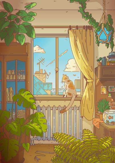
Lonely Afternoon 🌱#Mastoart #FirstFridayArtWalk #Illustration #Krita

@NIGHTEN It is lovely but my eyes feel more strained looking at it. It's totally a me problem!