RE: https://mastodon.social/@caseyliss/116131870233125130
OK. No joke.
I literally just updated to watchOS 26 yesterday, and did my first workout with it today.
And
H
O
L
Y
S
H
I
T
Seriously, I may stop using the Apple Watch over this
RE: https://mastodon.social/@caseyliss/116131870233125130
OK. No joke.
I literally just updated to watchOS 26 yesterday, and did my first workout with it today.
And
H
O
L
Y
S
H
I
T
Seriously, I may stop using the Apple Watch over this
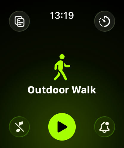
@jsnell @marcoarment @caseyliss I’m not sure where all the hate is coming from. I double click the crown, pick the workout app, then start my workout. It’s not great (the app takes forever to start up) but that’s nothing new.
What am I missing?
@jsnell @marcoarment @caseyliss Ah, got it. Thanks for the explanation. Yeah I only 2 kinds of workouts in the app, so it’s always either the first or second choice.
Having to wait for the animations does suck, definitely agree. I have a series 10 and it rarely feels snappy as it is, anything that makes it feel even slower is bad design.
@hokiewalrus @jsnell @marcoarment @caseyliss why is it that I need to hit that small green arrow on the bottom curving edge of the screen and not the picture of the workout, which is a reasonable touch target when I'm moving around. I literally can't do anything with that massive image/icon/title.
This UI is fine if wasteful when you're sitting at a desk. When I'm moving around, I can't tolerate its requirement for precision.