RE: https://typo.social/@a_vsn/116014361972002506
Was about to boost this from the Tiro account, but then realised this is a good fit for the personal account’s stated interest in #AutomotiveDesign
RE: https://typo.social/@a_vsn/116014361972002506
Was about to boost this from the Tiro account, but then realised this is a good fit for the personal account’s stated interest in #AutomotiveDesign
@tiro_j do you maybe know how De Vinne font entered Europe?
I'm quite curious to understand the popularity of it in the Romanian region.
I've also encountered quite often the Lateinisch font in the interwar press, so I wonder if these too fonts have much in common...

«Библиотекус» — личная библиотека Артемия Лебедева. Это целый сайт, на котором собрана значительная коллекция отсканированных книг о шрифтах и каллиграфии разных периодов и стран. Начиная со старинных экземпляров 19 века и заканчивая современными изданиями, сайт представляет собой массивный архив с огромным количеством ценнейших материалов.
@fhardwig thank you for the detailed explanation and links!
I'l dare to ask another question, what about the specific legs for the uppercase R & K, where do they come from?
If the typeface tried to revive an old style kind of fount, it must have traced something older, or is it an Art Nouveau influence?
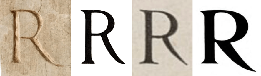
@a_vsn Apologies for the slow response. I think I can best explain this R-evolution with an illustration.
1. Roman inscription, 1st century AD.
2. Caractères Augustaux, 1846. Designed by Louis Perrin after sketches made from Roman inscriptions.
3. Beaudoire’s Elzevir, Fonderie Générale, by 1860. A commercial follower of Perrin.
4. De Vinne by Gustave F. Schroeder, Central Type Foundry, c.1892.

Anne Tyler’s novel Searching for Caleb was originally published by Alfred A. Knopf in 1975. Shown here are two paperback editions of later dates. The one issued by Berkley in 1983 features caps from a phototype version of De Vinne. With the relatively thick bars in E F H and t