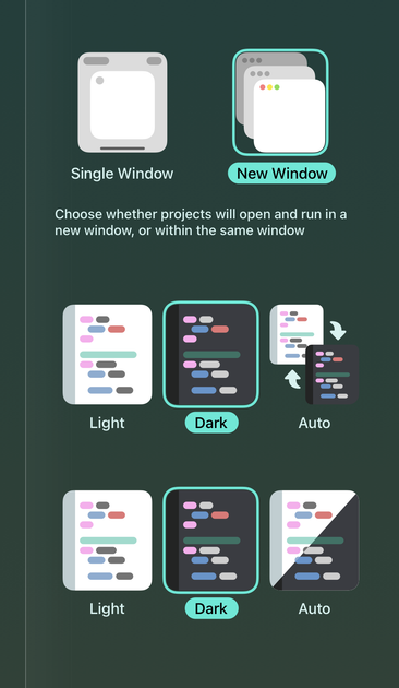
Working on some new settings icons for Codea. After using iPadOS on an external monitor for two seconds, I realised we needed an "open in new window by default" mode — so that's the top bit

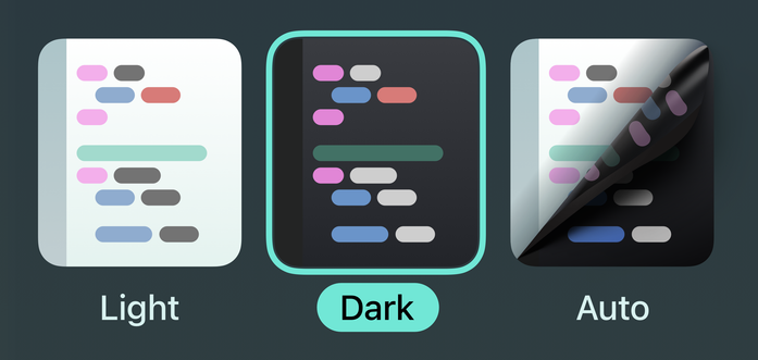
I decided to redesign the light/dark/auto editor theme icons to match. Not sure which "auto" design I like better

@simsaens I think both icons are great and while the one with the arrows has more personality, I think the bottom one is best. It better communicates what’s going on.
@simonbs thanks! You've helped me change my mind
@simonbs @simsaens I agree, the bottom one looks a bit like pulling off a sheet of light UI to reveal the dark one 🤓
@jacobras @simonbs I really liked this idea so I gave it a go
@simsaens @simonbs oh, that's neat! I do think the flat one looks clearer, though.
@simsaens I like the first one better (probably because it feels unique), but the second one is definitely more standard to what I’ve seen in discord/slack/other apps where I’ve seen this)