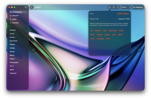
I have to admit, when Liquid Glass looks good, it looks _really_ fricken' good. The screenshot below is Wallaroo running on Tahoe.

When there's bold colors and minimal text, the Liquid Glass UI really shines.

The problem is that "bold colors and minimal text" _does not_ describe the apps I use all day on my Mac.

@chockenberry So I guess Liquid Glass's killer app is reading comics. ;)
@chockenberry The sidebar still looks like it is a whole separate window. So strange.
@chockenberry I don't use dark mode. Except for testing. But LG does look much better in dark mode. I find it's way too washed out in light mode. There's barely any contrast between the sidebar and main window content for mine and most other apps. Especially those that have nothing to display behind the sidebar.
@tapforms @chockenberry iOS or macOS?
@woolie macOS Tahoe
@tapforms huh, I haven’t seen it any better in dark mode (which I never use). I’ll look again.
@chockenberry sadly don’t like even that to be honest. Going to be rough going forward as been Apple for years.
@chockenberry I have to say MacOS Tahoe may be the first time ever I’m hesitating on upgrading day 1.
@Chigaze Don't do it - it's in VERY rough shape. I'm only using it in VMs and on old test devices.
@chockenberry The floating sidebar thing really trips me up. Liquid Glass would be acceptable if they truly supported a classic Mac view that worked well, putting accessibility first, but I suspect there’s far too much engineering work that that would require on everyone’s part. And they don’t seem interested in that idea at all.