"But #Bluesky is also federated, decentralised!1!!" Well, no. https://arewedecentralizedyet.online by @ricci
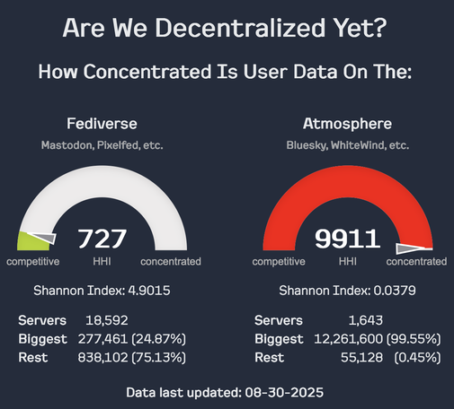
@jwildeboer off-topic re: visualization
The gauge might be easier to interpret if divided by labeled areas with colors and the number being the same color as the section it's in.
Something like
0 "perfect competition"
1 - 1499 "competitive" (blue/green)
1500 - 2499 "moderately concentrated" (yellow/orange)
2500 - 9999 "highly concentrated" (red/purple)
10000 "monopoly"
@ricci
@Flo_Rian @jwildeboer @ricci I'll repeat here what I posted elsewhere a few days ago regarding the 30 August graphs:
'I think the semicircle graphs are ambiguous. At first I interpreted the Fediverse graph as "very concentrated" because I thought the white area meant "concentrated". But of course, Fediverse was actually "very competitive" because the arrow is close to the "competitive" end of the scale.'
@0x10f @Flo_Rian @jwildeboer I realize that is an issue, but I wanted to use the actual metric, where lower is less concentrated, because I didn't want to go off modifying stats. I also thought doing the gauges backwards was likely to be more confusing.