
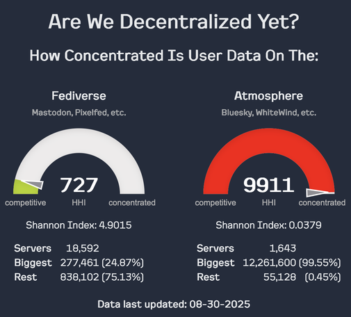
"But #Bluesky is also federated, decentralised!1!!" Well, no. https://arewedecentralizedyet.online by @ricci
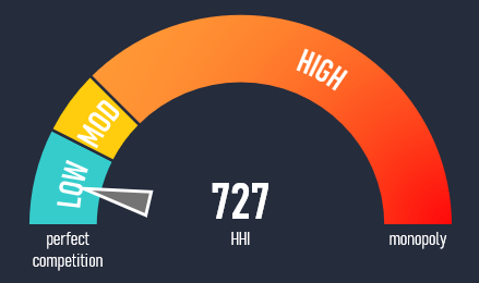
@Flo_Rian @jwildeboer That's an interesting suggestion, and I'm divided on it. On the one hand, I don't think it's 100% clear that the breakpoints used in antitrust are necessarily the right ones to use in this context, so staying fuzzy on the actual gauge might avoid suggesting sharp cutoffs where they don't really exist. (I did feel the need to include them in the text to give *some* context.)
On the other hand, I do think it would be good to show that there is still a benchmark for the fediverse to hit, that it can still get better
@ricci
I just had a hard time reading the graphs at first. Gauges (in reality) usually have a scale or zones, so we expect to be able to tell if we are in a certain range or hit "the red zone". In this case, one seems to have zones (green area, with the needle just on the edge), while the other one is all red.
To avoid sharp cutoffs, it could also be one large gradient. Alternatively, not using a gauge graph would be an option, maybe a partially filled bar chart.