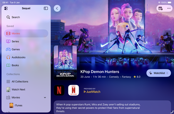
@sequel’s media details screen is getting a bold redesign for iOS 26. My goal has always been to put your content first by leaning into the richness of the media itself.

Inspired by Liquid Glass’ focus on content, the new design is both more expressive and more functional. It brings key information above the fold and, of course, it looks great on iPad too!

Check out the before/after video! #iOS26

It took a lot of work to keep scrolling smooth and to make sure content stayed legible but I think it was worth it.

There are a lot of subtle changes that build upon feedback I've received in the last couple of years. And this redesign also lays the foundation for future improvements and features that wouldn’t have been possible before.

@rlfb it's beautiful, and a good showcase for how nice Liquid Glass can look when done right 👌🏻 @viticci @johnvoorhees

@rlfb Looks really great 🤩 Sequel is one of those apps where Liquid Glass could look very nice. A lot of images, backgrounds - and it shows here!

Can't wait!

I've seen a lot of mixed feelings about Liquid Glass. It’s not perfect, but has improved a lot since beta 1. For Sequel, it just felt like the right fit.

I didn’t have to redesign Sequel for iOS 26. Instead, I tried to find synergies with my existing plans that could be better served by the new design. Like changes I was reluctant to bring with the iOS 18 aesthetic. In the end, I believe this new design genuinely improves the experience. I hope you’ll agree once you try it!

@rlfb @sequel Looks so fresh 🤩
And the added value of seeing the main information faster is great.
Can’t wait 😊

@rlfb @sequel I'd put at least 2 buttons instead of the "Add movie" button : Watched and "Add to watchlist"

I think it's annoying to click on "add movie", then click again on the dropdown and change from "watchlist" to "watched"

@matlfb You can long press on the Add button to access the menu directly =)
@rlfb I think I could switch from trakt if sequel had this option
@matlfb the design needs to scale for all media types. Unfortunately, that wouldn’t work for books or games.
@rlfb what if you edit the label? the first button would be for the library completion (reading, abandoned, finished...) and the second one for the wishlist
@matlfb ultimately, Sequel’s status system works quite differently from Trakt’s. Wishlist and the other statuses aren’t separate things, they’re a progression and this carries over to other places in the UX. To me, it doesn’t make sense to do just to avoid an extra tap or long press 😅
@rlfb @sequel “hooooo boy” is what I literally just said out loud. Can’t wait for this release! 😁
@JeroenSchaper at least it was the good kind of “hooooo boy” 😄
@rlfb it definitely was!
@rlfb @sequel woooowwww. Congrats! 👏🏼👏🏼👏🏼