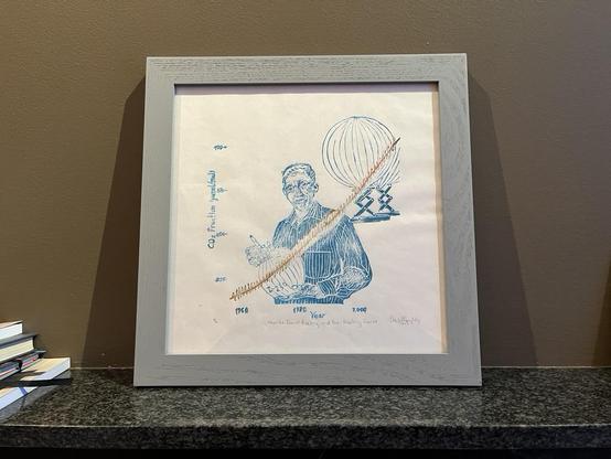
Take a long hard look at this graphic, the longest continuous direct measurement of atmospheric carbon dioxide. This is the famous Keeling Curve from the station atop Mauna Loa, Hawaii.
Trump and the GOP are closing the observatory.

https://scripps.ucsd.edu/bluemoon/co2_400/mlo_full_record.png

@petergleick

They want us ignorant because knowledge is power.

@petergleick Because it contradicts their Pravda.
@petergleick They seem to believe that if it isn’t reported, it will go away. Short-sighted jerks.
@petergleick Can’t another organization take over?
@JYeo18 @petergleick can they start a GoFundMe? How much would it cost to keep open?
@JYeo18 @petergleick there will be other measurements in other places, the interesting thing here is continuously monitoring it from the same place for a very long time, and in a place relatively far away from major co2 emissions (high up on a mountain, on an island) to get a good "base level" reading of co2 independant of local winds and pollution. Whoever takes over will not have the local historical readings to compare so far back

@petergleick

I've seen a similar graphic that marked off when each of the climate conferences took place. Didn't even matter... no progress has been made.

Corporate leaders have been flying in on their private jets, probably treating it as some kind of vacation. I can't help but think how hypocritical they are when they stare out the window and comment on the beautiful scenery.

It's what they should be there to preserve... idiots!

@petergleick
And the world learns a very hard lesson - that Science and rampant Capitalism are incompatible.
The world has been relying and leaning heavily upon USA's funding for science.
But not anymore, and never again.

@petergleick So, only two of those data points are from the Mauna Loa Observatory? Am I missing something? Powerful visual for climate change generally, but not a great graphic selection to defend the observatory itself. Why not build the chart using readings taken exlusively from this observatory?

I appreciate that it takes all sorts of data points to arrive confidently at these ones, and I believe climate change is largely manmade. I just don't think is going to sway anyone new.

Besides, the X axis is not at the zero of the Y axis.

It must be that the target audience of this graph excludes me.

@GrandTheftUrkel @petergleick

@vnikolov @GrandTheftUrkel @petergleick there are many plots not starting at the "zero" of the y-axis. Why does it bother?
@vnikolov @GrandTheftUrkel @petergleick I would seriously question this graph if the y axis started at 0, given that a zero value would never occur. The graph shows plausible ranges. Not every plot should start at 0. More than anything, one should consider whether the effect size is relevant.
@GrandTheftUrkel @petergleick no, almost all data (blac dots) is from Mauna Loa, only during recent vulcanic activity they took data from another side (blue dots)
@GrandTheftUrkel Every single data point comes from the Mauna Loa observatory. They take dozens of measurements a day.
@GrandTheftUrkel All data are Mauna Loa. The few Mauna Kea readings were during a period when the ML observations weren't available.

@GrandTheftUrkel @petergleick Mauna Kea != Mauna Loa

The blue dots are from Mauna Kea, all the black ones are from Mauna Loa.

@petergleick wondering ... what could the rest of the (scientific) world do to keep it open ?
@petergleick
The twenty-first century version of book burning. Small-minded people afraid to face reality.

@petergleick

A crime they should be held accountable for…

An act of political and ecological terrorism.

@petergleick GOP kills science to protect profits, not planet or people.
@petergleick Curve going up is your problem? Well, now curve will stop. Problem solved.