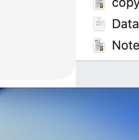
i know this is nitpicky potatoes but this interaction between the macOS Tahoe Finder’s sidebar and status bar is truly wild.

it’s an extremely hard problem to solve! when you suddenly “float” a thing that has to sit directly next to lots of weird things

@cabel I am working on a Mac app and Tahoe’s design has filled me with despair. No idea what I’m going to do.

Like what even happened? Nothing makes sense. Their explanations are word salad

@dmd @cabel they have made a platform I've used for decades now feel foreign to me. good job alan dye.
@dmd @marioguzman @cabel I was just trying to use Numbers Quick Filter. The UI is quite novel. Maybe random. Had to be done by an intern with no review.

@jgordon I think that’s giving the interns too little credit.

https://pdx.social/@louie/114744219377325313

Louie Mantia, Jr. (@[email protected])

@[email protected] The issue is direction, not execution. It’s not that I’m not there, or that another designer isn’t there. It’s that the company put people in directorial roles who don’t have good taste. I have no doubt there are many designers at Apple who could pull off the right thing if given good direction or if they had more power to challenge those without good taste.

pdx.social
@dmd @cabel I’m pretty much in the same situation right now.
@cabel It's also really hard to look at for OCD people. If Xcode is any indication, even the fix is problematic.
@cabel I am actually a big fan of Xcode but I am also nostalgic for this level of IDE UI.
@jblake @cabel if a document based app has an option for panels I almost always turn it on. It's so hard to use photoshop without it
@cabel According to their new design language, they would need to make this status bar transparent and use an edge scroll effect with variable blur instead, eliminating the divider line.
@cabel Design is how it … fuck it.
@cabel I, a ui plebe, think the status bar should extend full width but the text contents of it stay in the… visible “area” …gesticulates mildly.
@Luke @cabel Plebe? Haven’t you been designing websites for like ever?

@splorp Well, I mean, I love user interface but I just tinker with web design.

I found it! it's called the safe area for the Content View:

https://www.youtube.com/watch?v=VqTn9NgiE1s&t=566s
My thought is that when the status bar is on, it should be reflected left under the sidebar, too.
@cabel

@cabel The official solution to this problem is to mirror the content on the right and extend it underneath the side bar. Which is mostly OK for images.

Good thing that we never have text to the right.

@chockenberry @cabel they’re going to end up floating these elements like the tabs or the new Apple music controls, and it’s gonna drive me crazy. That’s the only way their new system works.

@louie @cabel And, of course, the desktop background will show through to "make it pop".

I feel like the root of these problems are the folks making these decisions don't understand the platform nearly as well as those of us who have been using it for decades. (Four, in my case.)

I don't see it getting any better until that changes.

@chockenberry Yes. I said this in my recent post too— I think some people working on this stuff don’t know, like, or even respect the platform for what it is. The fact that Alan Dye just was never a digital person until he was given this position says so much.

(I don’t think this applies wholly to the group. I just think the people who get it have been overruled by people who don’t.)

@cabel I really don’t like this silly looking floating sidebar in macOS 26.
@cabel There are children here, Cabel
@cabel I installed the beta last night, and after trying it that was literally the first thing I noticed. 😄 I hope it gets fixed before the final release.