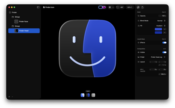
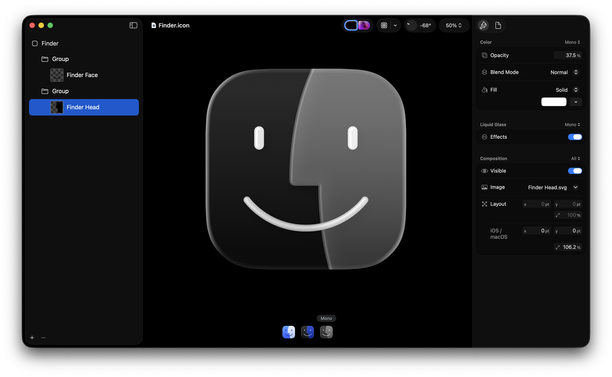
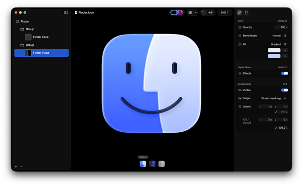
Not that anyone cares *when* I did this, but I made this 15 days ago.

It doesn’t seem hard to me to do this.

As a person who used to make app icons at Apple, I don’t think the situation is that the designer doesn’t know, but rather the decision maker who is supposed to have taste doesn’t know. (If this person isn’t Alan Dye, then that’s even more embarrassing for him that he’s not the person making that call.)

Also, slightly purpler is better. More Mac, less Mail / Safari like I said before.
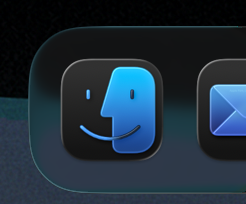
@louie Not trying to be a jerk, but I wonder if Apple ever considered eliminating that icon. Probably more than 95 percent of Apple devices that have a file system use a folder icon named Files now, so it seems like a needless friction point for new Mac users coming from iPhones or iPads.
@OldManJade @louie
When Apple removed color from the Sidebar the speed at which I find the folder I am looking for massively dropped and has never recovered.
Color and form is a huge part of how I navigate screens. I am STILL angry about that change.
@drewpickard Sorry about that. That was partly my fault. Steve asked for us to remove the icons altogether in the iTunes sidebar and I made single-color shaded icons as an effort to retain icons at all. He approved those, and later the whole system followed suit.
@louie
This is interesting because I always assumed the driver of this trajctory toward a white void was Jony!
Still hurts tho. 😭
@drewpickard We had those grayish-blue sidebar icons for a while before they were ultimately replaced by SF Symbols. I think Steve had thought the source list was starting to look messy. Perhaps the better solution would have been to tidy it up rather than remove visual cues, but— a fight for an alternate timeline I suppose.
@louie an important detail I forgot: the colored icons I used were all custom (a lot of icon factory of course). I got by with the various “hacks” for a few years but then those eventually were abandoned.
Thanks for the backstory. It is still wild to me how much in the details he was.
×

Like I don’t even understand why they went this route with the Dark version. Why... would you go about it this way? Keep the strongest point of contrast in the facial features. So on light mode, they’re the darkest color. On dark mode, they’re the lightest color.

I really, really do not like spending my time pointing this out. I could write a whole blog post but I don’t want to seem angry about it. I just think the right solutions are simpler than what they’re doing.

I just want to remark and say thanks for everyone who appreciates this.

This is not the first time I’ve spent my time addressing this icon during the beta phase of an OS release. Years ago, I mentioned the eyes weren’t centered, and people told me I was wrong and the eyes were “optically” centered, only for Apple to fix it in the next beta.

That being said—

I don’t really like working for free, especially when it benefits a three trillion dollar company. I don’t need a job from them. And I don’t claim to be the only person who cares about this. But I do resent a little bit that when I spend my time on these things that aren’t what I care most about, they get tons of attention. But when I post about things I just absolutely adore and want to spend all my time on, it gets considerably less attention.

The short of it is... if you followed me after this post, don’t be surprised when I don’t post about Apple design stuff for a while. I’ll probably post about some rad 千社札 I’ve been drawing the last couple days. If you like the 5 minute liquid glass surgery I did on Finder, maybe take a moment later to look at whatever art I end up posting later.

@louie I follow you mainly because I’ve enjoyed your artwork over the years and I love what you do and the competence you have in what you do. When you use that competence for UI design criticism for me it’s like a bonus gift — the new DLC for a favourite game.

For my part, I’ll try to be more responsive even when you don’t talk about Apple.

@louie I really like that last sentence. It’s almost like they’re trying to think too clever about it.
@duncandesi9n Honestly, cleverness is the worst poison a designer can drink. It’s not the key to making a good thing. It’s just the key to making people notice. And sometimes the job is not to make people notice it so much.
@louie My design teacher in college would sometimes write “clever” on a design, and it was her most scathing, damning critique.
@louie @duncandesi9n @louie Spot on. Yours is an authentic adaptation of the icon following solid design principles, but Apple’s dark mode Finder icon looks like they’re primarily trying to use it as a mascot for every single new feature in the new design (concentricity, layering, adaptive colour, etc), over staying true to the design… The kerfuffle with the beta 1 icon messing with the colours is kind of indicative, breaking the metaphor of face & screen.

@louie @duncandesi9n

1. mentally bright; having sharp or quick intelligence; able.

2. superficially skillful, witty, or original in character or construction; facile.

3. showing inventiveness or originality; ingenious.

1 doesn’t apply to non-sentient things, 2 surely isn’t the goal of design, but 3 I think is not a bad thing for your design to exhibit.

I always think of it this way; I don’t aim for clever solutions, but sometimes as I refine and perfect a solution it becomes clever and starts solving my problems for me. It’s the point at which I start feeling really great about the design—when every new problem and edge case is answered without any more changes.

@louie They are trying to be too clever. It’s as simple as that.
Louie Mantia, Jr. (@louie@pdx.social)

@duncandesi9n@mastodon.design Honestly, cleverness is the worst poison a designer can drink. It’s not the key to making a good thing. It’s just the key to making people notice. And sometimes the job is not to make people notice it so much.

pdx.social
@louie they're so glassbrained that they seem to go "only lighting should change on dark glass and we can't do stained glass, only stacked glass panes/tubes" like come on if your material doesn't work change it a bit for the good of the design, stop glassholing yourselves :p