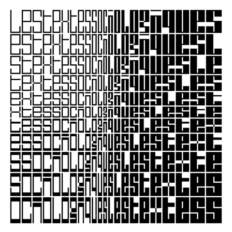
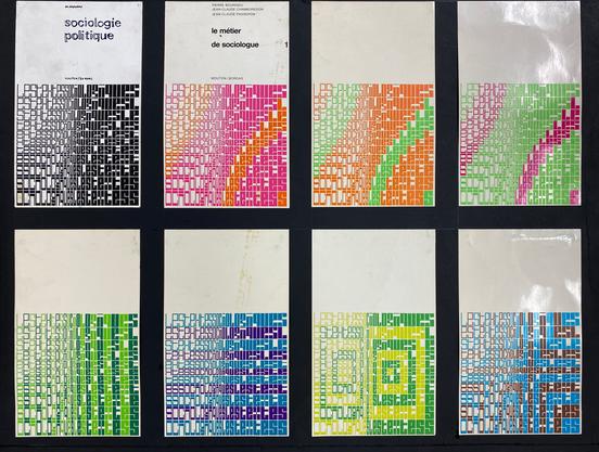
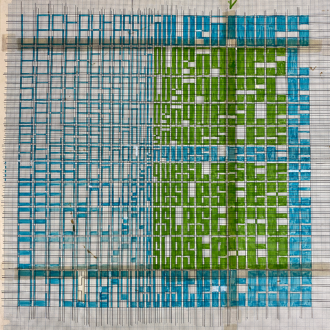
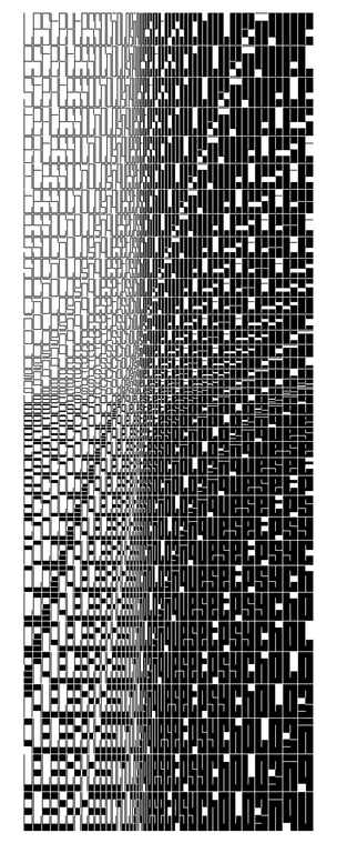
Still gathering Schrofer code … one recent update to @drawBot broke my original code for recreating the script patterns on the covers of Mouton's Les Textes Sociologiques series, but: revisions, et voila. Reconstruction, examples of the original covers, Schrofer's plan on graph paper, and a field showing the gamut of the variable font's horizontal/vertical stroke:counter axes.

Archive images courtesy the Jurriaan Schrofer Archive, Allard Pierson Museum, University of Amsterdam.

@MauriceMeilleur I thought that was DJR's Fit at first, but it isn't it seems. Is it a real font?
@pixelambacht The original lettering is Schrofer’s, a variable ‘font’ before its time. I created an actual variable font with axes that match his system to reconstruct the patterns.
@pixelambacht You'd have to ask @djrrb himself but I don't recall him mentioning Schrofer as a reference. The variation logics differ in that Fit has constant counter dimensions as you vary height and width that match the sidebearings and default linespacing. In Schrofer's design the height and width change the ratio of horizontal and vertical strokes:counters, but one side of each of those paired dimensions always matches the sidebearings/default linespacing.
@MauriceMeilleur @pixelambacht I don’t think I heard of Schrofer until you started this project, but yes a lot of similarities!
@djrrb @MauriceMeilleur I "knew" Schrofer and Crouwel because of their 80s computer aesthetic (as I interpreted it at the time). I love seeing these graphics. I can imagine these graphics moving on an old 320x200 screen!