Definitely true. In my tired, non-glasses state when I'm hitting that new Snooze button, I'm terrified that I'm going to accidentally hit Stop instead. It's SO close.

I never had that fear with the old layout.

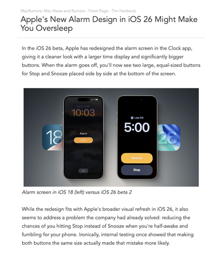
https://www.macrumors.com/2025/06/24/new-alarm-design-ios-26-make-you-oversleep/

@marcoarment It looks like the same approach to interface as on the Watch. Which makes sense on the Watch because (1) it’s so much smaller and (2) you can do the double-tap finger gesture to snooze on the newer Watches. On the iPhone, it’s a write-up for tardiness waiting to happen.
@marcoarment what do they mean “actually more likely”? As if that outcome was surprising? Of course the mistake would happen more often if the buttons are the same size. While we’re here though, I think there should be an option to disable to “stop” button altogether because I /still/ do it with the current layout. Make me go into notifications and swipe to stop the alarm.

@marcoarment well the timer and alarm layouts are swapped in the current layout so I learnt the hard way to use the Digital Crown for snoozing my alarm.

Are they consistent now?

@marcoarment
They could randomize the positioning of the buttons to make sure you're paying attention.
@marcoarment They have to at least create a button’s worth of space between them. This is a case where design needs to take a back seat to function.
@marcoarment I hit the wrong one by mistake already… though it’s snooze when I mean to hit stop, so it’s annoying rather than disasterous
@marcoarment maybe the fear will motivate us to just get up. :D

@DrChris @marcoarment Like you, I believe the purpose of an alarm is to wake up and get up, not snooze.

I rarely have the chance to hit snooze or stop as nearly always I wake up a few minutes before the alarm goes off anyway. According to mine and my Mom’s memory, I always have done that.

@marcoarment Definitely a step backwards in terms of usability, but you could always use the hardware sleep/wake button.

Also, I’m not sure that the exact button areas are all that strict. I felt like if I ever tapped in the general area of the snooze button it would work.

@marcoarment "Pro" tip, which lets you snooze without opening your eyes: find a volume button and press it. 😴
@marcoarment @phillycodehound Get a trump phone. You’ll never get to sleep again with that thing in proximity to your bedroom.

@josh @marcoarment @phillycodehound

You should sleep well knowing someone* always knows how well and exactly where you’re sleeping.

@godofbiscuits @marcoarment @phillycodehound That person is usually my spouse.
@godofbiscuits @marcoarment @phillycodehound I am not prepared to extend the same reciprocal family privilege to Tangerine Anus Lips.

@josh @marcoarment @phillycodehound

RFK wants us all fitted with bridles^H^H^H^H wearables within a couple of years. That’s all good and not creepy.

@marcoarment I think that’s the point. With the new layout you actually have to think, by forcing you to think you end up waking up! /s.
@marcoarment IMHO the snooze option should only be allowed once max. My wife sets her alarm for 6am every morning and snoozes 4 or 5 times, then heads for the shower leaving me to hit the final STOP at 6:36 or 6:45! It’s a form of torture! 😩
OTOH, I get to work from home! 🤫

@marcoarment why is practical alarm design so hard? Snooze button should be large, bright visually distinct from and no where near the stop button so there's minimal risk of mis-taps by tired people who don't have their glasses on.

There was an old long discontinued Android clock app that did this excellently. I have checked countless alarm apps on both platforms since, hoping someone will re-create it.

If you build it, I will buy it!

@marcoarment it’s an improvement in my book. That stop button is so small and low contrast I’m never convinced it’s the right button to press.

Bigger text is a big win. Even better if they could add some colour to it.

@marcoarment
And I guess I still can’t preset the alarm volume.
@marcoarment not only that, if you use standby mode, they swapped Snooze and Stop. Snooze used to be on the right. Now it’s on the left.
@marcoarment on a related note I still can’t understand why the macOS context menu for a mounted drive has eject and erase right next to each other.
@marcoarment One more proof that currently at Apple:
- they don’t use their own software that much if at all
- they lost a lot of knowledge and taste in terms of Design and what it means
- they put „form over function“ at the top of the priority list. Change whatever can be changed - doesn’t matter how it’s meant to be used „I don’t know this software anyway so I just make it look like everything else“
@marcoarment I'm also missing more color coding - in my sleepy, non-glass state I can never remember if orange is snooze or off - one should be red the other orange imho
@marcoarment I got so sick of the colors being different between alarms and timers. I bought a Loftie alarm clock. 👍 👍 Recommend.
@marcoarment just wait until you get older and you wake up without any alarm. Believe me. It happens.
@marcoarment i always felt like the old stop button was way too small. now stop and snooze seem to have the same size which i prefer. the distance between those buttons is another topic, though. overall i like the new design better
@marcoarment too this day as I wake up I don’t know which buttons is which. I need glasses and can’t read the buttons very well cause they are so small. I welcome the big buttons but yeah, maybe they could be further apart.