I’m a big fan of iOS 26 beta two.
Apple made lots of lovely tweaks. Especially where liquid glass is concerned.
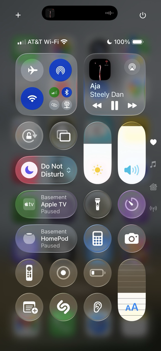
One tweak made Control Center more opaque, easier to read (see pic).
I’m a big fan of iOS 26 beta two.
Apple made lots of lovely tweaks. Especially where liquid glass is concerned.
One tweak made Control Center more opaque, easier to read (see pic).
@davemark Not to be a wiseass but rather suggest a change in framing. If I were reviewing this as a submission from a design job candidate:
What meaning is intended to be conveyed with the red Do Not Disturb, green ATV and purple timer buttons?
How is the user helped by these colors being different if they bring Control Center down over a different home screen page?
Whet value is derived from the ‘content showing through' under a modal interaction like Control Center?