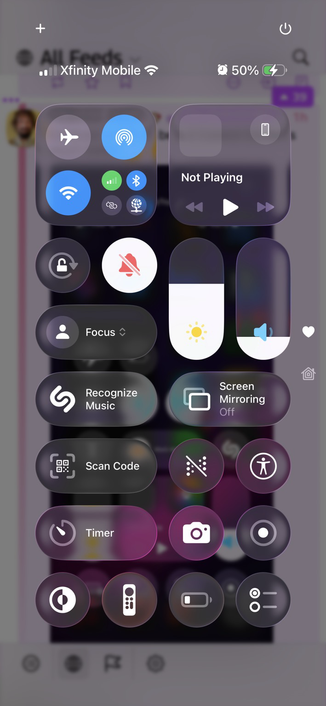
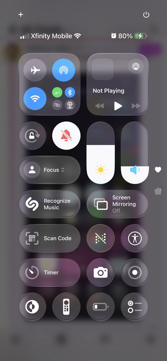
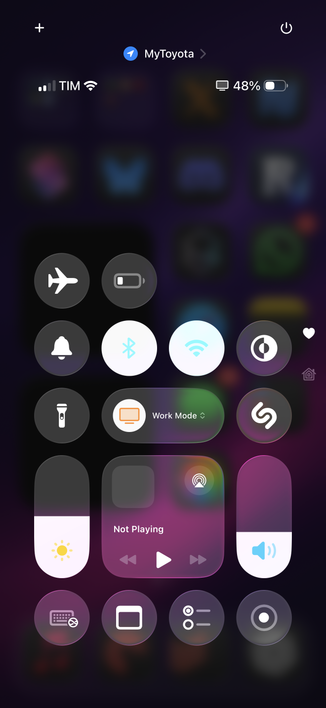
Contrast in iOS 26 beta 2 Control Center is much better 👍
@viticci nice at better backgrounds!
However, those light blue Wi-Fi and Bluetooth logos against a white background are far from good.
@viticci Does anyone wonder why Apple won’t do a 1px black stroke outline on their SF Symbols (and labels) to increase contrast?
Movie subtitles that have black stroke and white fill are legible for either a black or white background. We know people like this CX.