Continuously surprised by how much of a nice improvement the Alert views in iOS 26 are. They feel so much more at home!

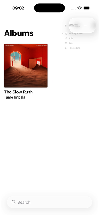
The contextual menus are also so so nice
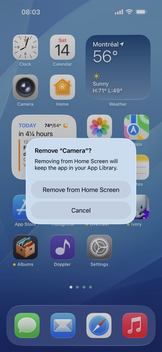
This is just a masterclass in interaction design. Fluid and interuptible all throughout!
ignore the weird artifacts / clipping missing, I'm sure that'll get fixed in future seeds
@b3ll these are lovely. Filled out a form on a website yesterday and things jumped so vividly. Felt a bit much.
@jpstuehler yeah, they're leaning pretty hard into the elasticity (fluid dynamics?? :D)
@b3ll it’s fun. Let’s see how this feels after a while. Still very early days.
@b3ll yes but they definitely need some polish, feels a bit swoopy to me and the backgrounds don’t line up with the content
@kylebshr yeah for sure, I'm hoping this is just a seed 1 issue though
@b3ll all the way at the end, the shadow abruptly changes opacity, which is jarring. I’ve been seeing this artifact a lot in the beta.
@b3ll I’m hoping they improve the performance over the next couple of builds cause on my 15 Pro Max it runs like shit 😂
@lilstevie yeah same lmao, my 16 Pro Max is a pocket space heater
@b3ll haha this thing is a battery incinerator. Like 2 charges to get through the day 😂