So, wanna see something funky about 🐭⚔️?

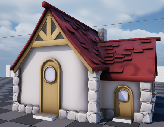
When you see a house like this, it looks, you know, decent, right?

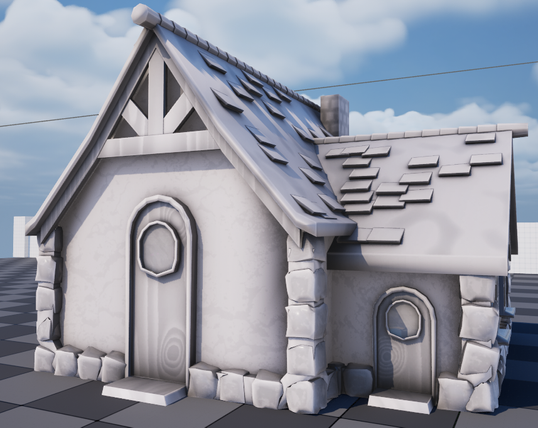
Well the colors are kinda faked on after the fact. What the artist ACTUALLY hands me, what the assets themselves are set up to look like, is this!

Any guesses why? Well you're likely wrong 🧵

"It's set up for tinting" - technically correct, but I don't intend to run these with enough variants where that matters. It'd be simpler to export a few variants with baked colors and call it good. Also, look at the gradients. That wouldn't multiply-tint well at all.

It's much simpler than that,

it's because I like to pick the colors, and my 3D artist doesn't, so we went "huh" and I just set it up so she doesn't have to think about the part she hates doing. I enjoy coloring. So I do that part.

That's literally it. It isn't a trick question. There's some advantages but really just: because.

Now there's neat stuff this lets me do (I map GRADIENTS to each material group, not solid colors, that's why the B&W is so value-heavy) but the point is more:

your art pipeline doesn't have to be like anyone else's. Evict the manager in your head. Figure out what works for YOUR team, and do that.

When you're a small team especially, you'll be struggling under tools, engines, and pipelines designed for teams 5x to 50x larger, and unless you really wanna get a AAA job next year (lol), there's no reason to do things their way. You'll be faster if you design around how YOU work, in the long run.

This pays off in larger ways, too! This is how you establish a house style.

Does this weird material group gradient tinting thing have downsides? Iunno, probably, none that matter to me but sure.

But it also makes a world that look distinctly Ours, because it channels how we have to use color.

In the end, establishing aesthetic is mostly about making a handful of consistent choices that ripple out. Pick a font (ONE font unless you're very good), decide what you think about color (we're functionally palette-based because of this), texture, silhouette, form, then just be consistent with it.
@glassbottommeg thank you. this thread was great :)
@glassbottommeg Hell yeah, all this, 100%!
@glassbottommeg If only people would not confuse this healthy attitude with "ah, who needs version control anyway"... I like your example with the colors though. Just saw the other post first.
@glassbottommeg have you tried mapping the greyscale textures to gradients? This can be really really effective.

@PsySal Heh, I realize you got to this later but yeah I do really like doing this! It's something I saw people doing over as a texturing method for certain styles and thought, huh, I bet I can do that runtime,

and I can! Unreal's color curves + curve atlas are GREAT for setting this up, lets me basically work out of a giant context-sensitive palette.

@glassbottommeg also another good thing is if you can tweak colours a bit more flexibly than you can other art assets, it's easier to adjust and get a cohesive look. Again small team stuff as you say!!! Rather than "match this concept art atlas exactly as possible" you can go "this red is a bit much somehow..." after the fact

@PsySal yep! totally!

Which is why I try and really limit the total number of colors in play, since it makes it easier to kinda, pull the world together

@glassbottommeg ha, that's awesome.