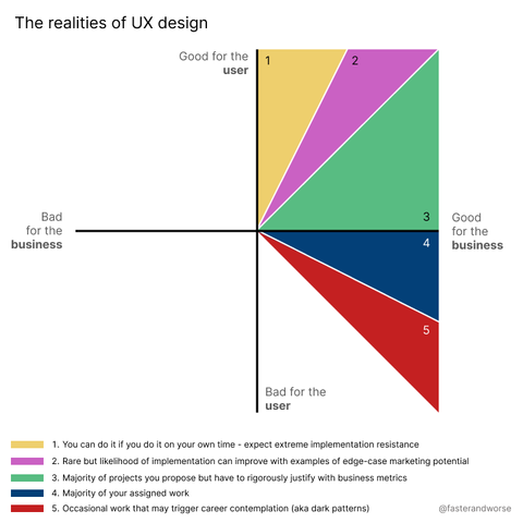
@fasterandworse it’s good. But without reading the notes, its visual impression is that each sector is of roughly equivalent likelihood. I wonder if opacity could convey some sense of probability
@urlyman I agree it's not as clear as it could be. I also think they should be circular with some overlaps. Plus I need to acknowledge the bottom left quadrant