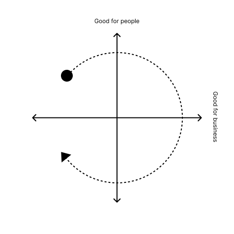
I posted this on twitter ~3y ago and it struck a chord.

Still relevant?

@fasterandworse it’s good. But without reading the notes, its visual impression is that each sector is of roughly equivalent likelihood. I wonder if opacity could convey some sense of probability
@urlyman I agree it's not as clear as it could be. I also think they should be circular with some overlaps. Plus I need to acknowledge the bottom left quadrant
@fasterandworse There's nothing on the left side, which feels off, given how much poor UX there is which harms the business that produced it
@jackeric I agree! and the funny thing is this was NEVER mentioned 3 years ago when I first posted it, but today I've had many responses saying the same thing
@jackeric @fasterandworse to properly address that you’d need to distinguish between short term/long term.
@BenAveling @jackeric yes, we'd need to take this chart to 3d
@fasterandworse where is The Ribbon (aka Stupid Ribbon) on this? I'd put it about 4.5.
@fasterandworse

agency costs, incomplete information and limited competence mean there's plenty in the bottom left quadrant too
@fasterandworse bottom left corner is where idiot vcs live and don't even realize it
@fasterandworse other people and yourself have remarked on the empty bottom left but I can't help to point out that this is especially relevant now that "AI" is pushed into everything. A ton of ways LLMs are integrated are solidly stuck in that quadrant, at least in the mid/ long term.

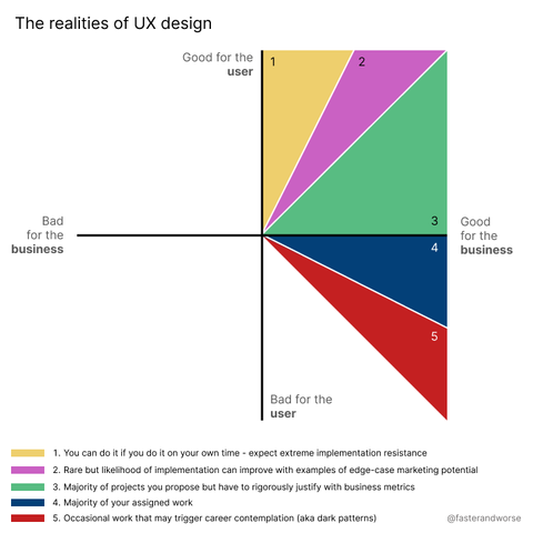
@halfbyte Yep, I'll have to make a better version because the amount of people commenting on this compared to 3 years ago is remarkable.

Perhaps this can fill the gap for now https://hci.social/@fasterandworse/113889745088142031

Stephen Farrugia (@fasterandworse@hci.social)

Attached: 1 image the cycle of stuff

🌱 hci.social
@fasterandworse hah! I can only speak for myself and the people around me but I'm afraid a lot of people got a lot more cynical for many a reason. Unfortunately (maybe?) the only group I personally observe as still being genuinely optimistic are the people fully invested in the AI hype train. Sometimes I am not 100% sure which side is missing something. 🤣
@halfbyte that's similar to my interpretation as well.
@fasterandworse And this is why I no longer work in software development. Shoutout to my ex-boss who told me that the feature I implemented in the yellow/pink area didn’t count towards my performance goals because it used the older codebase. (Which the application was written in. IOW, I didn’t waste time rewriting the entire application to implement a UI feature.)
@superflippy well done for getting out! Give me tips!
@fasterandworse I don’t recommend doing it the way I did, with my doctor sending me to the hospital for severe burnout followed by my boss giving me a PIP & then firing me.😅
But once I was on my own, I took the opportunity to focus on the skills I enjoyed & freelanced.
@superflippy I'm glad you recovered, though. What did you end up doing? Is it all in your handle?
@fasterandworse a lot of people already covered the bottom left quadrant; the upper left would probably be stuff businesses were forced to implement due to new regulation? but only if they couldn't find a way to be malicious about it, e.g. here's a list of our 2137 advertising partners you need to uncheck individually because "we value your privacy".
@fasterandworse Sounds like this video I watched yesterday by former UX designer turned artist, struthless. https://www.youtube.com/watch?v=ctM2TIXDFQs
Internet Fatigue: why this place sucks now

Thanks for watching :)Pre-order my new book!!https://lnk.to/DoomAndBloom Get the book, Your Head is a Houseboat: https://smarturl.it/YourHeadIsAHouseboatWrit...

YouTube
@fasterandworse Missing an entire half of the map. Many cases of UI work that is bad for the business
@neilk yes, this is the most common response this time round