I don’t think it’s possible but one day I would like to figure out how to get people to engage with my artwork beyond the content of it.

I know I draw a lot of pop culture things. And I know when I draw a NES controller icon there’s an urge someone might have to say what their favorite NES game is. But— that’s not really related to what I’ve drawn, is it?

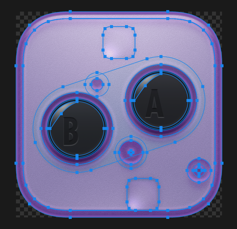
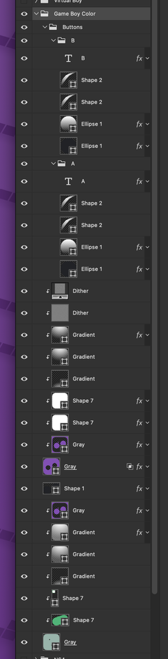
It’s so rare that anyone actually comments about the iconography. The artistry. The design, the assembly, the process, the ...anything.

No one ever dives into asking about color or commenting on how to handle translucent objects when you can’t rely on blend modes. No one asks about inspiration or talks about how I get from idea to final execution. How to make ICNS files? Or what the difference between two different 512x512 assets are. I’ve basically never heard anyone ask me about recoloring icons and which method works best.

It’s always a surface-level response. I don’t know how to change that. Or if I can.

@louie Hey, it would actually be super nice to see some process :) Earlier iterations of an icon, sketches if you have, or even just an outline view of the final?

Maybe posts like that could invite more reactions of the kind you wish you had, and also remind people (besides designers) that there is actually a lot of work behind these, and would be very interesting to see anyway, process posts are always fun!

@louie Like when I saw the transparent Game Boy icon I thought “would be fun to see the outline or the layers of that!” but didn't ask haha sorry.

To be clear, don't want to give you more work, more that if you already have older versions saved or feel like screenshoting an outline or posting about process, I think it's always welcome and might start the right conversations, since it doesn't start naturally from your followers themselves?

@nclm You’re right! Maybe posting some more of those kinds of things would help that kind of interaction.
@louie @nclm I am enthralled by the complexity behind these. ❤️
@gurupanguji @louie @nclm Also I thought that Apple was the only one who did multiple radii for their squircle radii when there are concentric squircles. Am I wrong in observing that Nintendo does it too? And maybe Apple was actually inspired by Nintendo?

@louie @nclm Oh hell yeah. This is the stuff.

The transparent Wii “A” button has me interested too. I thought “Dang, that’s a ‘lickable’ button”

@louie @nclm Like a peek behind the curtain. 😍

@louie This is super nice and informative to look at, thanks! The small versions, are they special adjusted versions for that size, or are the elements already aligned on a grid in the big version so that they fall into place in the small versions?

Edit: Just saw you already answered this in new posts!

@louie @nclm I've always been curious about the way that you add texture to some of your icons. Are these built-in effects in Photoshop or is it more custom? Any tips would be appreciated!
@classyraptor Any specific icons you’re referring to?
@louie Sorry, I should have been more specific. I was referring to the light purple part of the icon you posted screenshots in the thread, but your icon for Magic Passport also comes to mind (https://parakeet.co/app-icons/magic-passport/) I really love the clean paper material texture on that one.
Magic Passport App Icon