September 18, 2013: Apple released iOS 7.
@BasicAppleGuy A very sad day in history.
@BasicAppleGuy a sad downgrade of design 😔
@BasicAppleGuy The world lost something that day. Apple walking a lot of it back over time means they feel similar vibes.
@BasicAppleGuy That was the OS that really pulled me in to software! I loved the clean look and finally got interested in tech.
@BasicAppleGuy That was a huge step in iOS design – in a positive way. Looking back everything prior looks just plain old.
@BasicAppleGuy I miss the vibrancy of iOS 7.
@BasicAppleGuy the day @ChrisPirillo had a part of his heart ripped apart and never fully healed. ❤️‍🩹
@mountdiscovery @BasicAppleGuy ...it's been nonsense ever since. Control Center management is as much of a fiasco as the home screen has been.
@BasicAppleGuy It was the right step at the time but I think now that we’ve had 11 years of this design era, a lot of us are ready for the pendulum to swing back to more fun and realistic design paradigms.
@BasicAppleGuy I will remember it as the day my iPad 2 (2011) went from ”smooth animations and high performance” to ”slow and generic”. Yet, over the years I think Apple has iterated to the point where iOS looks really good but it was not a given that they would be able to abandon the old and tried while making the new design look and behave right, back in 2013.
@BasicAppleGuy I love how the comments are split between best and worst day in iOS design history. There is no middle ground apparently. I have nostalgic feelings for old iOS and I think it’s kinda cool. But I also like flat and clean software design. Both is cool!

@padraig @BasicAppleGuy it reduced a lot of burden on the designer, but overall net negative for the user. Skeuomorphism in general allows us to estimate what a button does from looking at it based on 200 years of history doing similar things. With a flat metro design you have to learn from scratch sometimes.

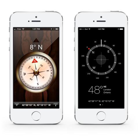
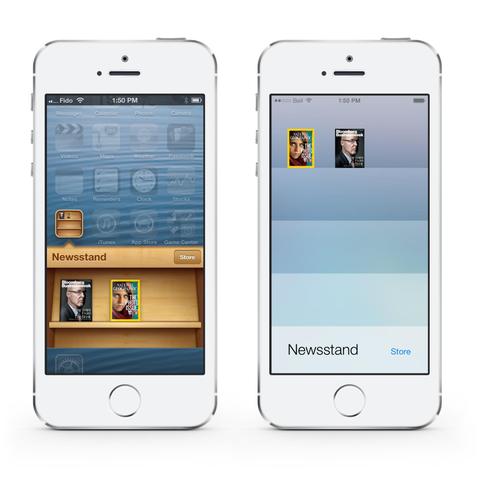
Occasionally they’ll be a call back to a Braun Dieter Rams - the device should be self evident how to be used. But not always.

The worst offender was Snapchat

@BasicAppleGuy I'm not gonna lie, it was polarizing when I first saw it, but grow on me quite fast. It looked really good on the iPhone 5c, had a light airy aura to it. #iOS #2013 #iPhone
@BasicAppleGuy The day that design died 😔
@BasicAppleGuy I kinda miss the whimsy. But as a programmer with little artistic skill I absolutely love flat and minimalist design as that is something I can at least come close to pulling off.
@BasicAppleGuy The number of people who stuck with the OS anyway despite whiny whine whine look at how horrible it is, though..
@BasicAppleGuy I remember how shocked I was by the radical approach. One app I used, Kinetic, went from fully skeuomorphic to completely flat and I did not like it at all. Now, in hindsight, the old design only looks tacky.
@BasicAppleGuy While I think the earlier look of iOS is dated now, I always felt that 7 went too far in flattening things out and making a lot of navigation murky and unclear. It was also kind of sterile? Hard to come up with the right word. Today? It's just there, and sort of boring. I've accepted its limitations.
@BasicAppleGuy And they still ship this extremely ugly icon for Safari. 😵‍💫 It’s wrong in so many ways. I replaced it years ago thanks to the work of a good friend.