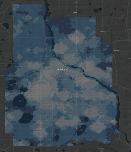
I'm back on track. I downloaded the official city boundary of #minneapolis from their open data portal and used my hex grid generation tool against that, and it worked. Now to plug this into a second run of #WalkPotential calculations.
Some other cities have used "Walk Score" for planning, but that's problematic both because it's expensive and also because it's a black box, which is bad for equity.
Do Walk Score factory in liquor stores but not wine? Community centers but not churches? Salons but not barber shops? Art museums but not brothels? It's a secret. Those choices contain some bias, but you can't see them and you can't adjust for them. 🧵
The code I'm running today, #WalkPotential is #OpenSource. You can look at the "amenities.json" to see what amenity categories we use and how we query for them.
https://gitlab.com/markstos/walk-potential
You can search for any of those categories individually and confirm (and improve!) the accuracy of the data.
Walk Score is likely querying incomplete and some inaccurate OSM data as well, but there's no way to find and fix those errors.
Here's #WalkPotential for #Minneapolis. Lighter color indicates more categories of amenities within a 10-minute walk. Darker is more car-dependent... or a lake.
Behind this is a hex grid with detailed scores for over 10,000 block-level locations which can be used for precise planning analysis.
#openstreetmap #mapping #urbanplanning
That's a wrap for my live-blog thread! 🧵
Since I had all my tooling and context at hand, I went ahead and calculated Walk Potential for a second city that expressed interest, #GoshenIN
Lighter color indicates more categories of amenities within a 10 minute walk.
For a city this size of about 40,000 people, each of the data processing steps takes just about a minute or less.
#walkpotential #urbanplanning
/home/mark/Documents/Mapping/Goshen/2024-05-25-goshen-in-hexgrid.geojson
Here's #WalkPotential for #RichmondIN
Lighter color indicates more categories of amenities within a 10 minute walk.