Useful stuff
@VeroniqueB99 - useful info. Since it is a graphic with scientific background, giving very broad ranges in terms of height above ground (in tens of miles), there should also be an understanding that giving the equivalent distances in km should also be rounded to the nearest tens of km.
Giving the calculated values with "ones" and even "tenths" of km implies unwarranted precision.
@axel_hartmann I think the explanation is simple: it's a quick google equivalency and done.
@VeroniqueB99 @axel_hartmann Translation - they couldn't be bothered to worry about significant figures.

@VeroniqueB99

Oh, cool!

(I wonder why some nitrogen comes out purple & some blue?)

@VeroniqueB99
I'm excited. Are you?
@GatekeepKen yeah!!! Pics have been spectacular so far...

@VeroniqueB99 This version has cut off the top and bottom, including the creator's credit.

https://ohai.social/@CaramelizedShallots/112423244493134515

Caramelized Shallots (@[email protected])

Attached: 1 image Updated post with complete graphic #aurora

ohai.social

@VeroniqueB99

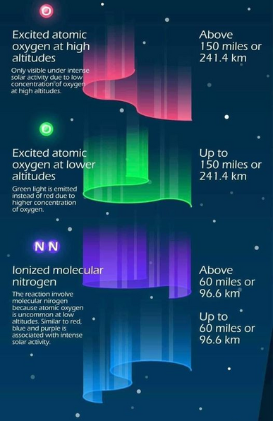
You may have noticed from the pics last night, that most did not have green. High latitude more likely to have some green. Low latitude more likely to be only pink-red.

#Aurora

@SpaceLifeForm correct, that's why I like this infographics, cuz I had seen NL before and always greenish hues... that one was PINK so I was wondering...

@VeroniqueB99 @mymhug Please note

https://ottawa.place/@MichaelPorter/112423945548409795

and distribute the version with attribution to the author.

Michael Porter (@[email protected])

Attached: 1 image I’m seeing this graphic making the rounds without attribution - many versions have the info at the bottom cut off. The creator is alienyrox2 on reddit (https://www.reddit.com/user/alienyrox2/). https://www.reddit.com/r/coolguides/comments/ic1g5o/colors_of_aurora_oc/ #Aurora #CreditYourSources #AltText

ottawa.place