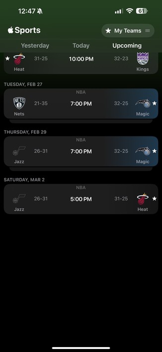
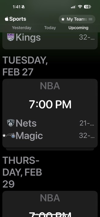
I’m so disappointed in the design of the new Apple Sports app, which does not degrade gracefully on smaller screen sizes, like my iPhone SE2.
Apple used to get this stuff right.
I’m so disappointed in the design of the new Apple Sports app, which does not degrade gracefully on smaller screen sizes, like my iPhone SE2.
Apple used to get this stuff right.
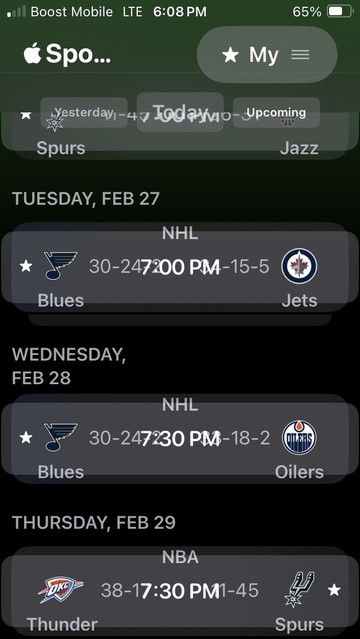
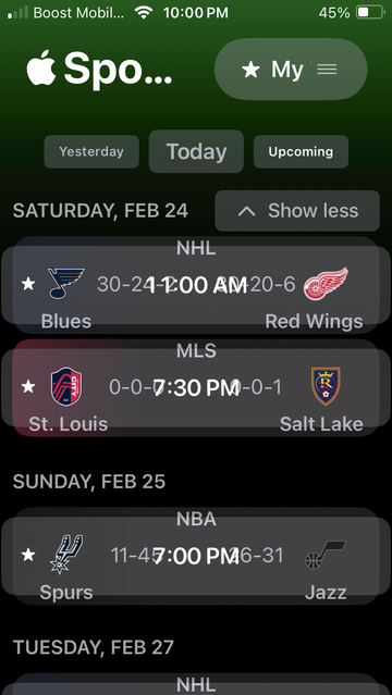
@lonnie I do have display zoom set to “larger text.”
Changing it back to default helps a little, but the scores still overlap.
Here are two screenshots for comparison.
@Kirkman @lonnie Both an iPhone 15 plus and iPhone SE would be considered as having a horizontal size class of .compact, regardless of what the device width is in pixels. So, they’re checking the width of the device in pixels?
And it doesn’t support Split View on iPad when Stage manager is off. So, it doesn’t support multi-tasking. Something is funky.
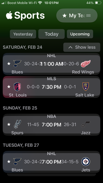
@Kirkman @lonnie You have “Button shapes” turned on in accessibility. And the entire row is a button.
Accessibility > Display & Text Size > Button Shapes
Thats why there are backgrounds around the ranges, why content seems to spill out of the rows, etc. Still, not good, but at least it makes some sense. It significantly changes the layout